From Web2 to Web3: How Web3 in Web Design Is Redefining Online Ownership
See how web3 in web design blends blockchain, wallets, and UX to create secure, decentralized, user-first digital experiences.
Serif and sans serif, are the two words that most people commonly hear but get everyone confused. You can easily find those two words whenever you want to decide the font type you want to use. In fact, you don’t have to be a master of graphic design to understand them. Even so, understanding their characters can give you benefits to make your design look more captivating.
Similar to colors and other graphic design elements, typefaces also can give certain emotions and impressions to those who see them. It’s not just about the text on your design. But, beyond your imagination, this design element can give a little touch of magic things with the powers they hold. Along with that, the typefaces you choose can also affect the feeling of your audience. Whether elegant or casual, you can create those kinds of feeling through the typeface you use. Thus, before deciding on serif or sans serif, you have to understand the purpose of your design first.
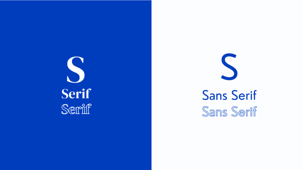
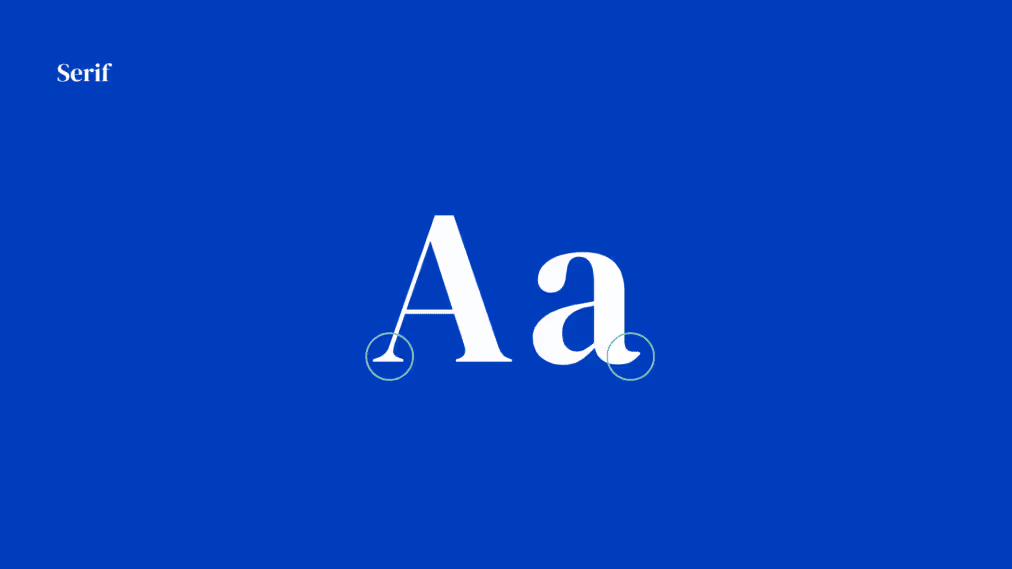
Serif is one of the oldest fonts discovered back in the 1400s. The additional tails at the end of each stroke make this font so iconic. Those flicks remind people of the quill or pen that radiates classic and elegant energy from the Victorian era. However, by that time, there were a couple of things that made the old serif styles changed.
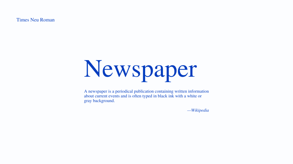
In the transitional styles, the additional strokes are more vertical than diagonal. Aside, there is a distinct contrast between the thick and thin lines. In addition, they are also more delicate, flat, and bracketed. Times New Roman, for example, this font was specially designed for the newspaper which made this font a bit narrower than most text fonts. It has sharp serifs with short brackets, lobes, and ears on the ‘g’ making the text easier to read.
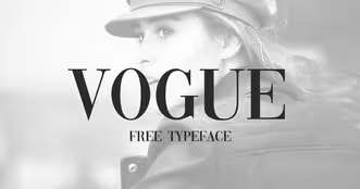
The fonts in this family are known for their dramatic contrast between the thin and thick strokes. Aside, they have thin, long horizontal serifs, and clear-cut transitions in each stroke. Other than that, the stress is drawn vertically without a slant on the letters. Due to its well-structured strokes, this type of font creates an elegant and eye-catchy look with a larger size. In contrast, using these fonts with smaller sizes can create dazzling effects that are completely uncomfortable for the eyes. Thus, use them for the heading to create an incredible look for your design.
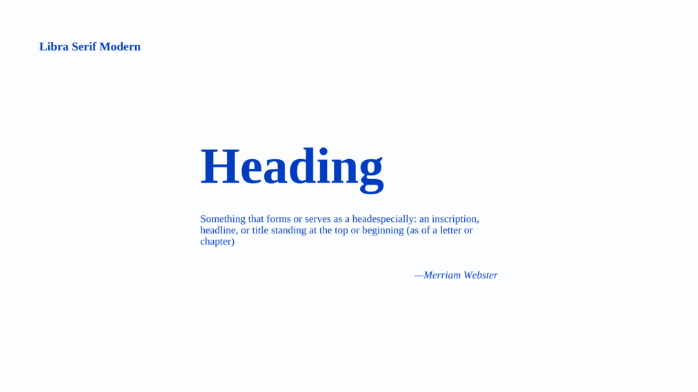
With the long history and the characteristics they hold, Serif fonts give a sense of classic and timeless nuance from time to time. They are the perfect choice for businesses with long-standing practices. No wonder many high-end brands such as Rolex, Dior, Vogue, and Mercedes-Benz use this font style in their logo to represent their elegance. Other fields like journalism, law, finance and wellness services are recommended to use this typeface for their branding.

Unlike serif fonts, sans serif gives more modern vibes to the design with its high legibility. The fonts don’t have a tail or additional decorative strokes at the end of their letterforms. This characteristic makes the overall appearance looks more minimalist. Many sans serif fonts like Arial, Open Sans, Glacial Indifference, and Roboto are popular now. They have a clear look that makes people likely to use them for their web design since they have a lower DPI (Dots per inch). Other than that, you can also find this typeface in the children’s books.
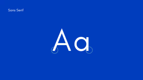
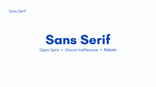
Sans serif fonts have a simple and minimalist look that can create a casual, informal, and friendly impression for those who see them. This typeface can radiate energetic and dynamic energy. It is the best choice for companies that has a youthful and casual image. That’s why many start-ups and tech companies like Facebook and LinkedIn use this typeface to represent their brand.

There are a ton of serif and sans-serif fonts, you can apply for your design. Whether for heading or body text, you can try both of them. However, there are still plenty of things you need to consider before applying those two.
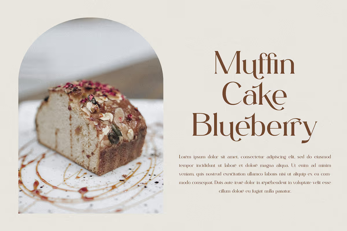
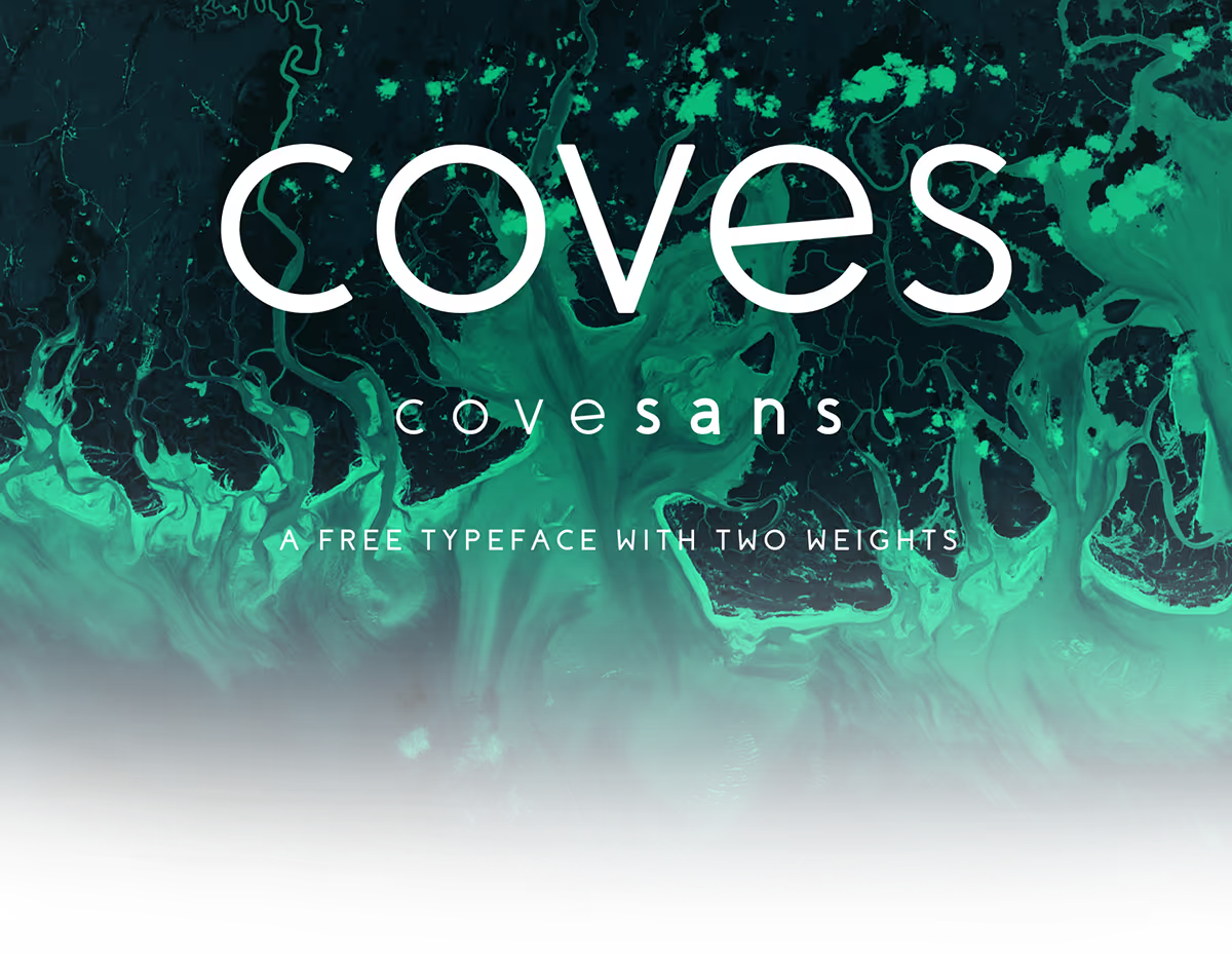
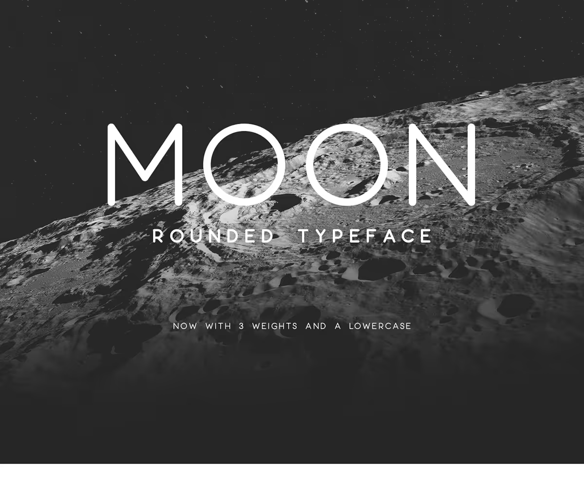
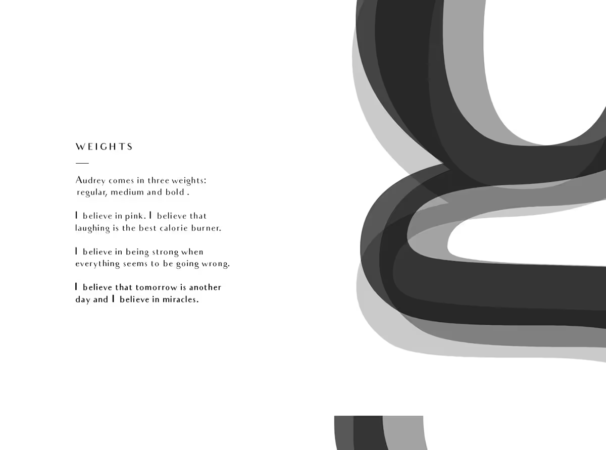
Serif and sans-serif fonts are varied. There are more than 300,000 fonts that exist. And this number will not stop right there. There is space to increase this number. You can get your favorite fonts on some websites like Google Fonts, Behance, Dribbble, DaFont, and many more. Or maybe you can choose one of the following.
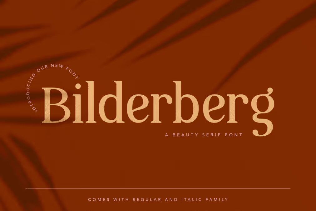
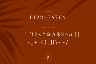
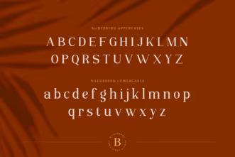

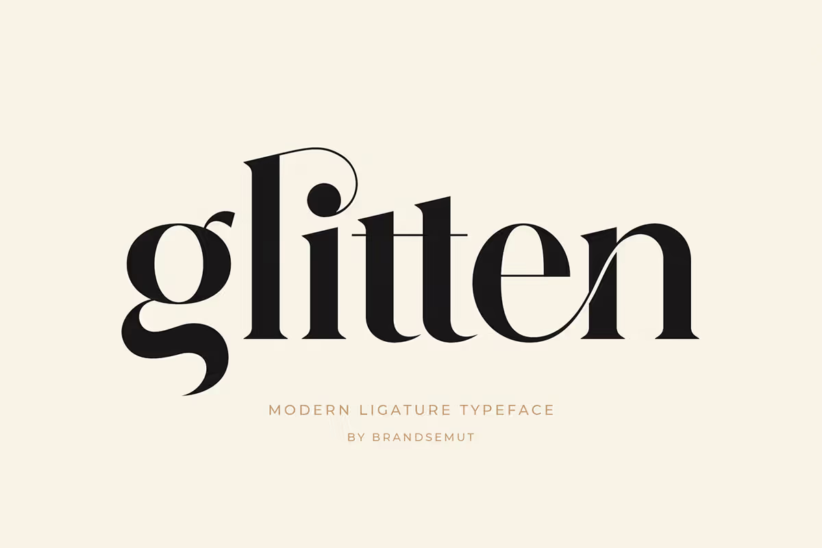
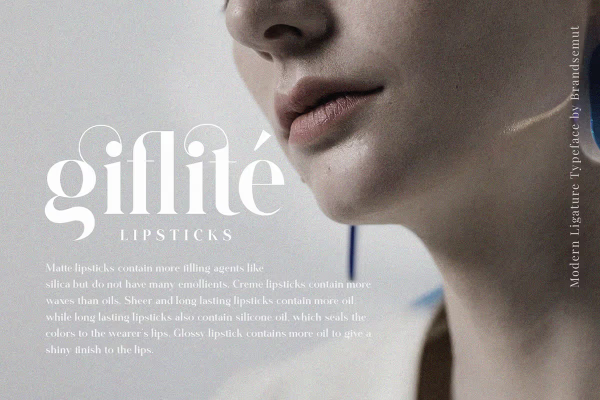
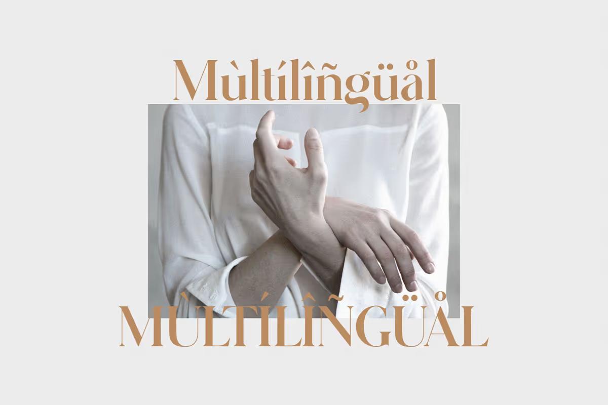
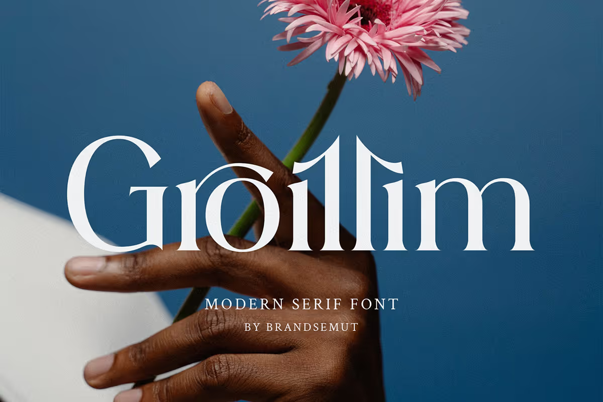



No matter what typeface you use, just make sure that they can deliver your messages. Other than that, make sure that the fonts you choose are readable enough. Because at the end of the day, the purpose of giving text in your design is to deliver a message. You must not want to confuse your audience due to the wrong fonts chosen.