
Bold Typography: Mastering Impactful Design for Maximum Engagement
Master bold typography with expert tips on where to use it, the best font recommendations, plus practical techniques to make your designs more impactful and memorable.

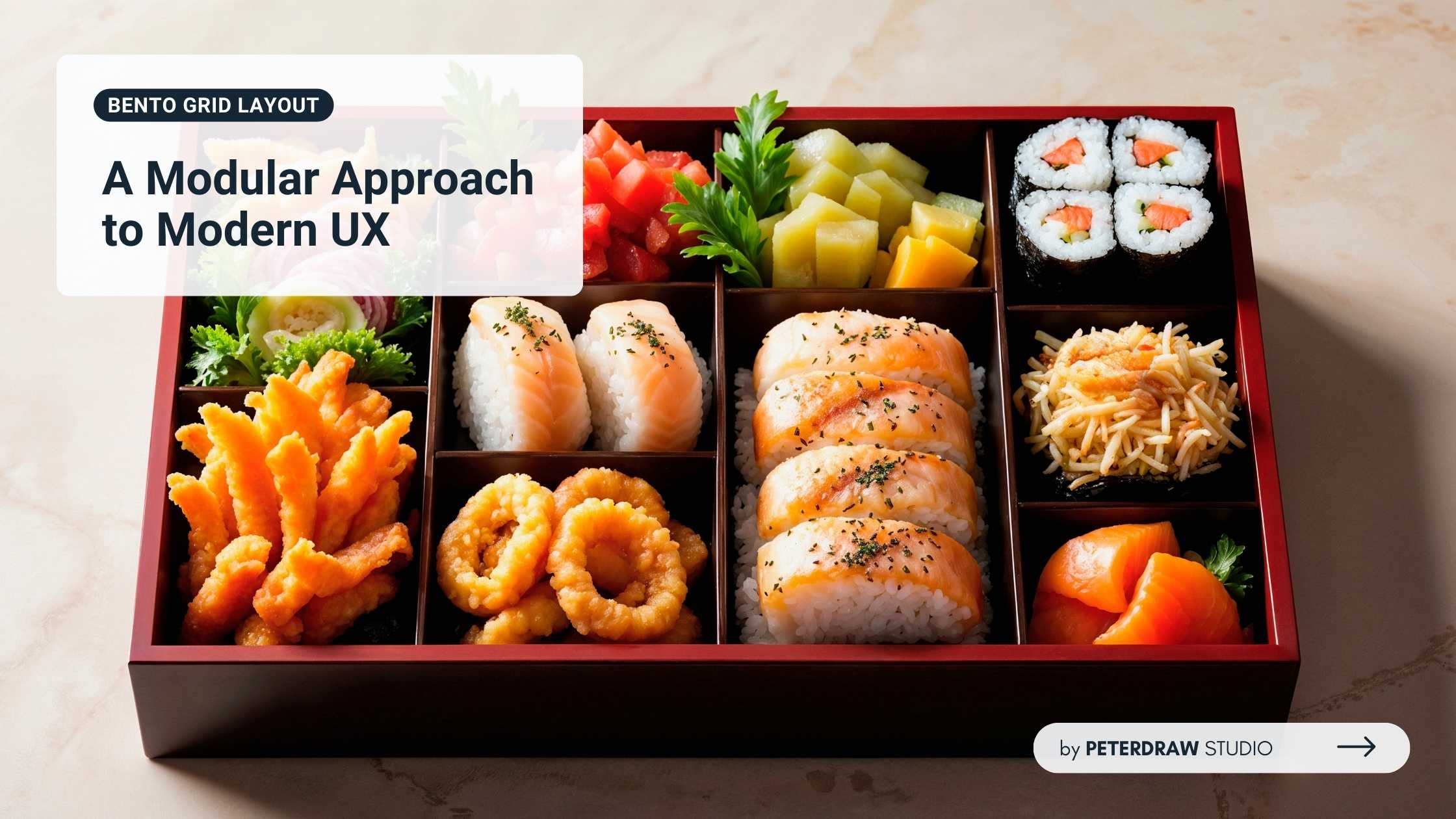
Trends come and go, but some feel timeless in both form and function. The bento grid layout is one of them. It has become popular for balancing aesthetics with usability. Also called bento box UI or modular grid design, it helps designers structure dashboards, mobile apps, and web experiences across platforms.
This layout draws from the Japanese bento box, a neatly compartmentalized meal. Each section has a purpose, yet the whole feels balanced and appealing. Bento grids apply the same idea to interfaces. They separate content into clear blocks, improving scanability, hierarchy, and visual rhythm without sacrificing personality or creative flexibility.
The bento grid layout echoes Japanese bento boxes, where compartments separate ingredients for balance and visual appeal. In UI design, it gained momentum around 2023–2024, shaped heavily by Apple’s product pages and marketing tiles. Those clean, tile-based showcases for iPhone and MacBook turned spec lists into quick, engaging visuals.
By 2025, the trend solidified as CSS Grid matured and utility frameworks like Tailwind CSS streamlined layout building. Designers could compose modular cards faster, maintain spacing consistency, and scale patterns across responsive breakpoints. Meanwhile, sites like bentogrids.com and curated feeds on Dribbble and Figma fueled constant experimentation.
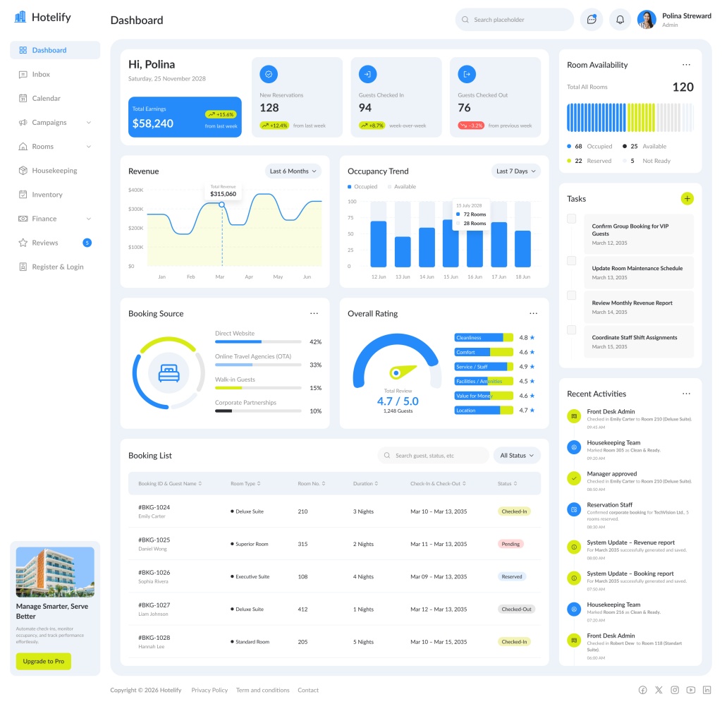
In 2026, bento box UI moved beyond static landing pages into dashboards, mobile apps, and widget-style system surfaces. Interactive states, real-time data, and personalization made the grid feel alive instead of purely decorative. Adoption by brands like Samsung, Netflix, and Notion suggests modular grid design has lasting power.
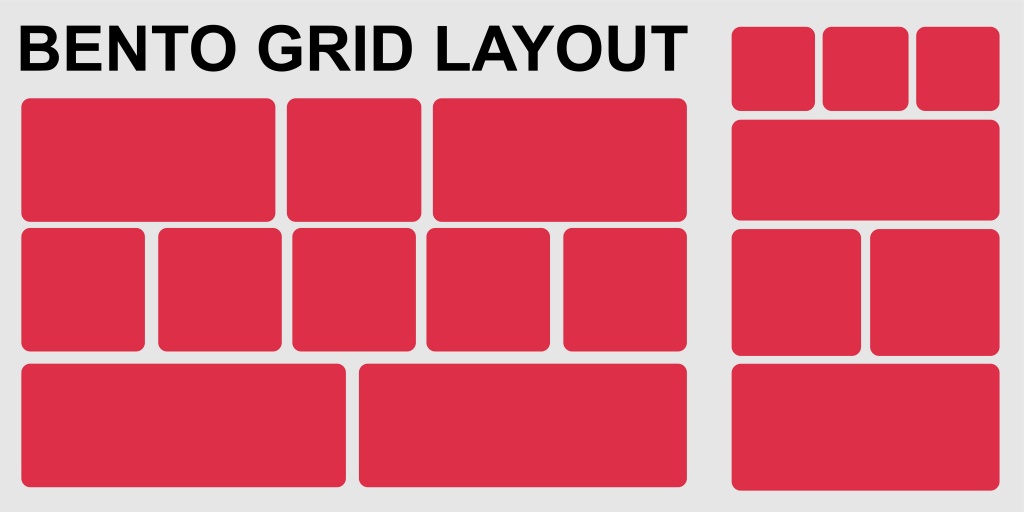
The bento grid layout brings clarity to busy interfaces without feeling crowded. It makes content easier to scan, compare, and understand at a glance. Designers like it because it stays flexible across different screens. The modular structure also helps teams scale layouts smoothly as products and content grow.
The bento grid layout adapts easily across many interface types and industries. It supports both content-heavy screens and minimal, brand-led sections. Teams use it to showcase features, data, and actions with visual consistency. Its modular blocks also fit responsive patterns, keeping layouts stable across desktop, tablet, and mobile.
Implementing a bento grid layout starts with smart planning, not complex visuals. Define your content blocks first, then decide how they should relate. Keep spacing consistent to maintain a polished, premium feel. Use clear hierarchy so important tiles stand out naturally. With the right setup, layouts stay flexible as content changes.
Using CSS grid:
.bento-grid {

display: grid;

grid-template-columns: repeat(12, 1fr); /* Flexible columns */

gap: 1.5rem;

}

.item-hero {

grid-column: span 6;

grid-row: span 2;

}

.item-medium {

grid-column: span 4;

}
For mobile, prioritize vertical stacking with media queries.
A bento grid can look polished, but it still needs thoughtful decisions behind it. Consistent spacing, clear content grouping, and reliable interaction states matter a lot. Small mistakes can make the layout feel messy or confusing. Keep these principles in mind for best practice:
Challenges include avoiding clutter; balance asymmetry with consistency to prevent overwhelming users.
Designers can streamline bento grid layout creation with modern tools. CSS Grid remains the core for custom builds, enhanced by frameworks like Tailwind CSS (with ready bento components) or Bootstrap. For no-code prototyping, Figma plugins and communities offer free templates, while Webflow and Framer provide drag-and-drop bento sections.
Inspirations abound on sites like bentogrids.com, Dribbble, and Muzli. Libraries such as Bento UI Kit for React accelerate app development. Start with these to experiment and refine your modular grid design efficiently.
This pattern remains a cornerstone of modern interface design. It evolves with active grids, adding animations and AI-driven personalization. Some teams even explore subtle 3D depth for emphasis. As experiences expand into VR and AR, modular structures stay adaptable. It also pairs well with kinetic type and sustainable design.
For designers, modular grid thinking strengthens portfolios and real products. It is more than a passing trend in UI work. It supports usability as digital experiences become more demanding. Apply the approach to apps, dashboards, and marketing pages alike. Embrace the bento grid layout for interfaces that feel organized and future-proof.