
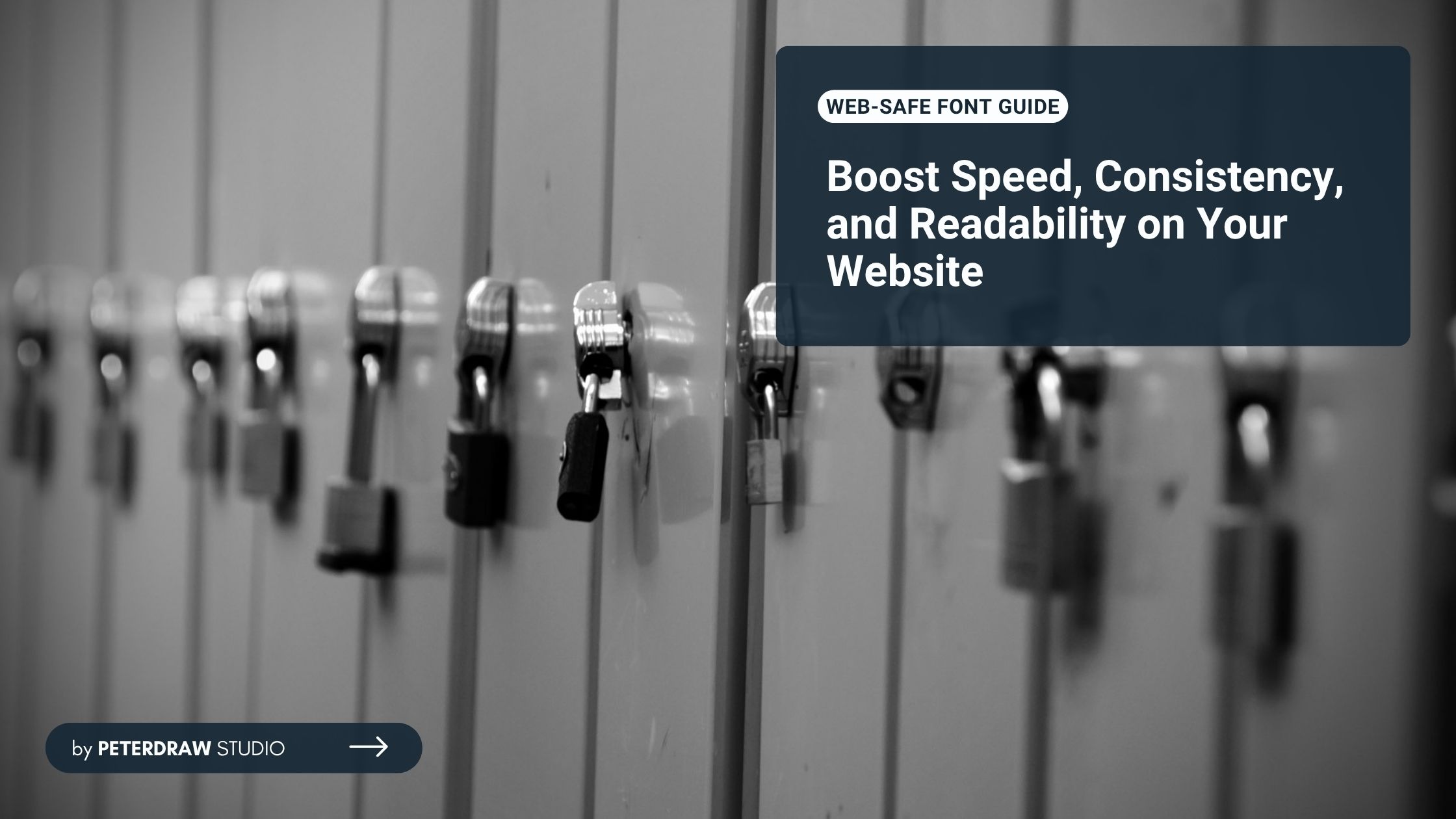
Web-Safe Fonts vs Google Fonts: Which One Should You Choose for Your Website?
Compare performance, design options, and expert tips to create fast, beautiful websites with perfect typography using Web-Safe Fonts vs Google Fonts.


Card UI design has become a cornerstone of modern digital interfaces across websites and apps. From e-commerce product grids to social media feeds, card ui design organizes content clearly. Its compact, modular layout improves readability and supports flexible layouts across different devices.
Effective card UI design balances aesthetics, usability, and performance across modern digital interfaces. Cards group related elements like images, titles, and CTAs into scannable content blocks. This structure mirrors familiar physical cards, helping users understand information quickly. Furthermore, This interaction pattern increases engagement while keeping complex information organized and accessible.
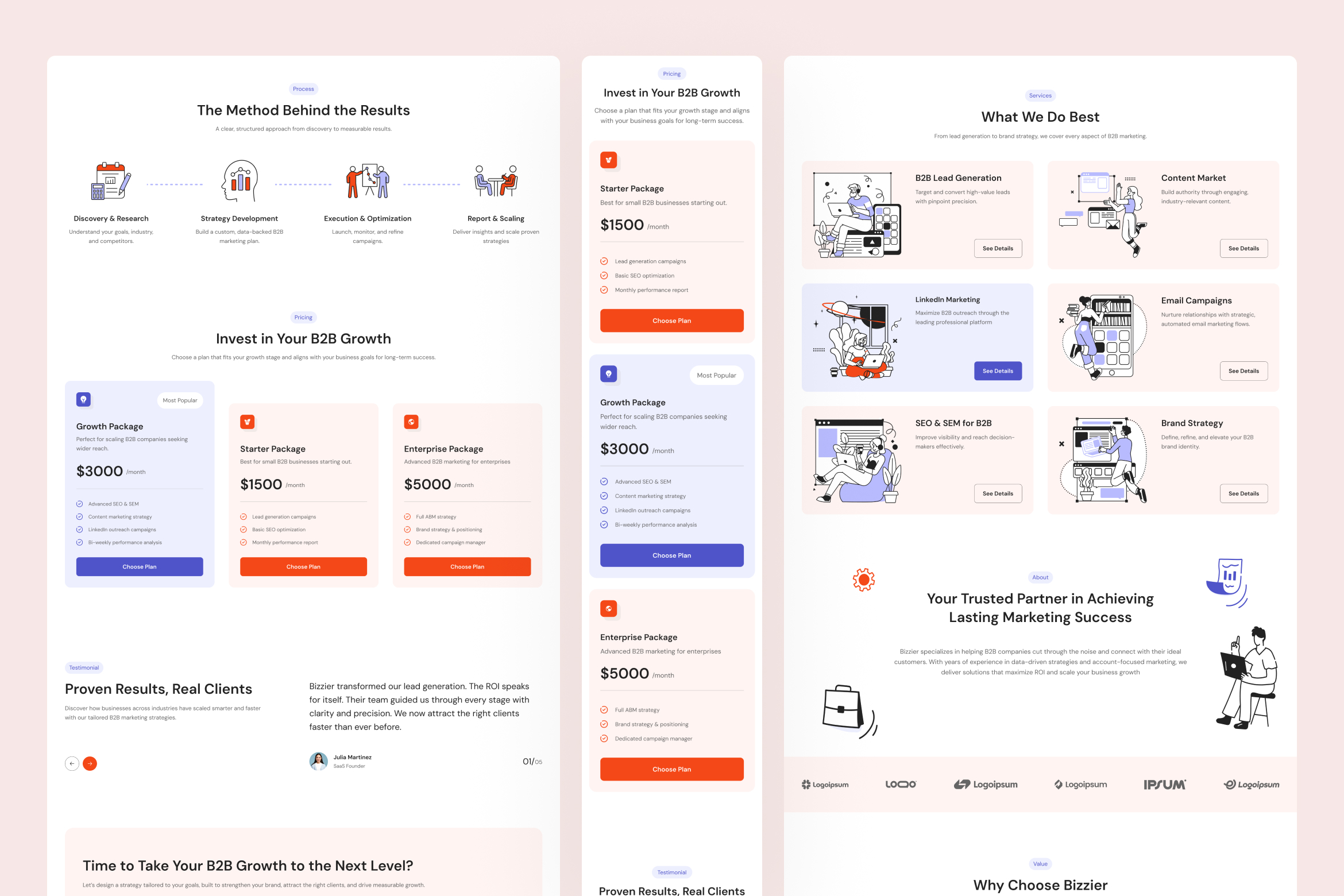
User psychology plays a key role in effective card UI design decisions. Strong visual hierarchy guides attention using size, spacing, contrast, and consistent alignment. These cues help users scan content quickly and prioritize important information. Platforms like Pinterest and Airbnb use card layouts to support fast browsing and decisions.
Strong card layouts begin with thoughtful structure, clear hierarchy, and purposeful content placement. Designers should focus on readability, spacing, and interaction cues that guide user attention naturally. Follow these proven practices to create compelling card UI designs that convert and delight.
Use uniform spacing, alignment, and sizing across cards for a cohesive look. Consistent horizontal and vertical gaps (e.g., 12-16px minimum) prevent visual chaos and improve scannability. Group similar cards together to reinforce themes, like categorizing products by type.
Highlight critical info with typography, color, and scale. Bold headlines (5-7 words) grab attention, followed by concise metadata (10-15 words) and verb-based CTAs (1-3 words). Subtle shadows or borders create depth, separating cards from backgrounds.
Position primary CTAs in the bottom third for easy thumb access. Make entire cards clickable with hover effects like color shifts or elevated shadows to signal interactivity. Square cards work best on mobile; rectangular ones suit desktops.
Limit each card to one core idea, e.g., a single recipe or product. Keep content snapshot-like: one hero image, short text, and minimal metadata to avoid overload. Use grids to scale widths responsively across breakpoints.
Poor card layouts often result from cluttered content, weak hierarchy, or inconsistent visual structure. Ignoring spacing, alignment, or responsive behavior can quickly reduce readability and usability. Steer clear of these pitfalls to ensure your card UI design remains intuitive and performant.
Avoid cramming multiple ideas or excessive text into one card, as it overwhelms users and increases cognitive load. Skip long paragraphs; users scan, not read, stick to 1-2 lines of supporting text.
Poor contrast between cards and backgrounds makes elements blend. Never use tiny fonts; aim for balanced sizes where headlines dominate without crowding. Fancy scripts harm legibility, choose clean, sans-serif typefaces.
Fixed widths fail on varied screens. Don't force multi-column grids on mobiles; they stack poorly and frustrate taps. Always test for fluidity, ensuring cards reflow without breaking layouts.
Excessive flips, videos, or sparkles clutter interfaces. Limit to one subtle animation per card, like a hover lift, to maintain polish without distraction.
As design systems evolve, card UI design continues adapting to new usability and performance expectations. Modern interfaces now prioritize accessibility, responsiveness, and meaningful interaction patterns. Consider these advanced practices to keep your card UI design relevant and effective.
Accessibility is essential in modern card UI design, ensuring interfaces work for all users. Use semantic HTML elements such as <article> to define card components clearly. Provide visible focus indicators to support keyboard navigation across interactive card elements. Test accessibility using tools like WAVE Web Accessibility Evaluation Tool. Ensure images include alt text and touch targets measure at least 44 by 44 pixels.
Inclusive card UI design also considers visual comfort and motion sensitivity. High-contrast modes improve readability for users with low vision or color perception differences. Support reduced motion preferences to minimize animations that may cause discomfort. These adjustments improve usability without sacrificing visual style or design consistency. Accessible design ultimately creates better experiences for wider audiences across devices and contexts.
Tracking performance helps determine whether your card-based interface supports effective user engagement. Monitor metrics such as click-through rates, bounce rates, and time spent browsing card grids. Heatmaps reveal whether users overlook key CTAs or important information. These insights guide improvements that make card layouts clearer and easier to navigate.
User testing provides deeper understanding of real interaction patterns within card-driven interfaces. Observe how users scan content, interact with actions, and interpret visual hierarchy. If small text slows scanning, increase font size for better readability. Iterating based on data helps refine layout decisions and improve overall usability.
Thoughtful execution transforms card UI design into a powerful structure for modern digital interfaces. Clear hierarchy, responsive behavior, and accessibility ensure cards remain intuitive across devices. Following proven practices helps avoid clutter and strengthen user engagement. Ultimately, well-crafted card UI design helps create interfaces that feel organized, engaging, and easy to explore.