
Bold Typography: Mastering Impactful Design for Maximum Engagement
Master bold typography with expert tips on where to use it, the best font recommendations, plus practical techniques to make your designs more impactful and memorable.

One single color can make your design look alive. However, you can make a difference and rock it more with a unique color combination. That’s why you need to know the best color combo for your brand along with the color psychology. It’s not only for your logo but also for your website. Here, we have summarized the best color ideas that you can deal with for your business.
Combining some colors can be tricky sometimes. A great color combination can draw attention. Moreover, it also can evoke emotion and leave an incredible impression. Otherwise, it won’t go as you wish if you choose the bad one. Thus, you don’t have any other option but to choose the right one.
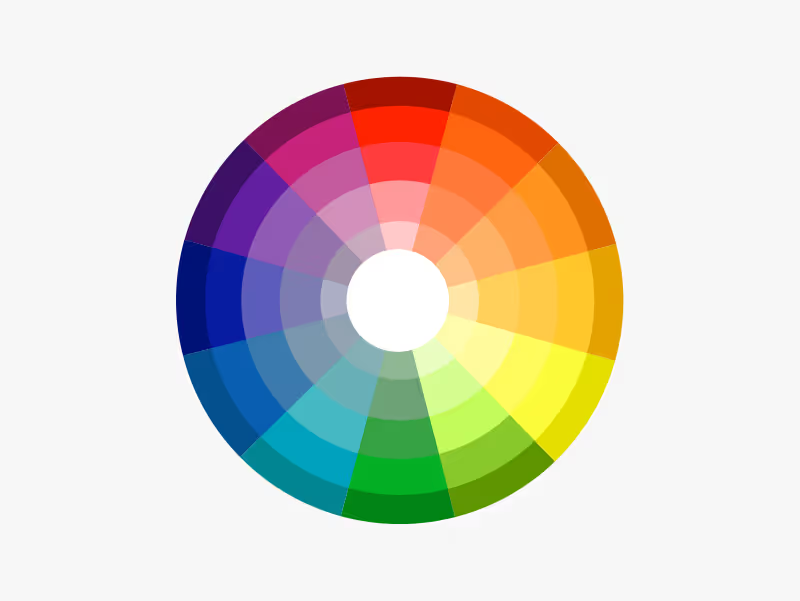
But before going to choose the color palette for your brand, you need to know about the color wheel first. It is a circular arrangement of the chromatic relationship between colors. Aside, it shows what colors that contrast with each other and what is nearby. As a result, it can guide you to create a harmony of color schemes.

Speaking about the color combination for your website also takes a crucial role to create a positive perception for your visitors. Why? Aside from the logo, a website can be the face of your brand as well. Most people like to visit the website to confirm and find the truth. No wonder many companies work hard to make their website as reliable as possible. And the color palette on your website can play an essential role here. It can simply create certain impressions as you wish like in the previous article we discussed. You can use monochromatic, analogous, triadic, or tetradic color combinations for your brand.
When we talk about the fashion industry, we can’t mention only one style. This industry has a wide range that every type of style can touch, from minimalist-luxurious and high-end to bright and cheerful styles.
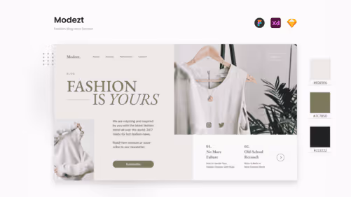
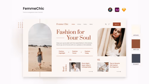
Like our products, Modezt and FemmeChic. If your brand is inspired by the nature, these website templates are perfect for you then. Both Modezt and FemmeChic have a calm color combination adopting the monochromatic concept of the earth tone. Modezt uses an alabaster color as the background and green moss as the accent. Meanwhile, FemmeChic applies chestnut color as the highlight. The concept and style of those templates match well creating a fascinating design. Who can resist their charm of them then?
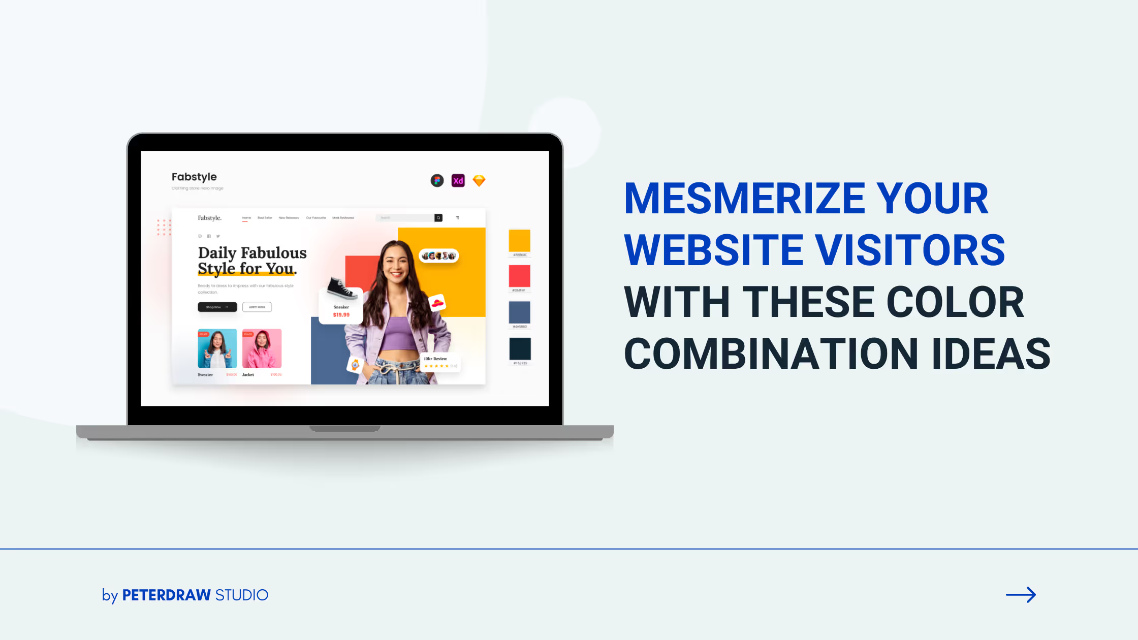
How about applying playful colors to your fashion marketplace? Why not? Basically, the fashion industry never limits the players to play with the concepts and colors. You can also try playful colors like how Fabstyle does. This is an example of the use of a triadic color combination. This template puts bright yellow, salmon pink, and pastel purple in one color palette. As a result, this combination can easily deliver youth energy that is full of bright colors.

We can’t separate the existence of women and beauty products. No wonder players in this industry use some colors that are associated with female audiences like pink, purple, white, and other pastel colors. You can take our products Gloqueen and Faebula as examples. They use pastel colors that can easily attract the attention of the audience. For Gloqueen, the pink pastel color dominates the overall layout design. It creates a feminine look that is perfect for a younger audience.

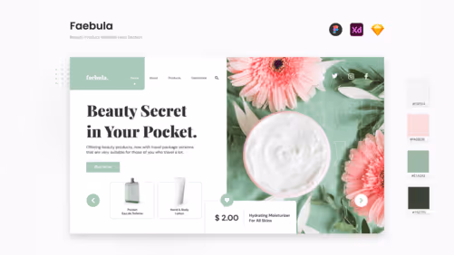
Whereas for Faebula, the pastel mint color dominates the layout making the template look even more standout. Along with that, the color chosen affects the audience’s perception that the products are natural. Moreover, the typeface used in this template makes it look more editorial, stylish, and remarkable. Shortly, you don’t need to work hard to draw attention. Let it do its job for you!
There are many types of business in the culinary world. Starting from casual coffee shops to fancy fine-dining restaurants. You can play with colors that can create a certain impression on your business.
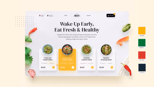
For instance, when you want to promote your healthy restaurant, you can play with shades of natural colors like green, yellow, and blue. This is what Bell Fresh and Healthy Food App try to make your website look more appealing. Those two templates follow a Triadic color combination to create their palette. The first template, Bell Fresh, uses yellow and other primary colors as accents. Whereas Healthy Food App plays with blue to create friendly and healthy products.

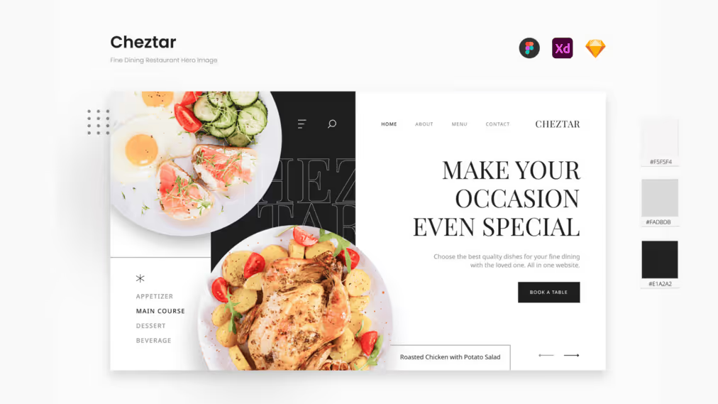
In contrast, when you want to make your audience feel a fancy experience, you might choose elegant colors like black and white like How Cheztar does. This template has a minimalist and elegant design with a monochromatic color combination. In more detail, it pairs white, black, and grey in one canvas, creating a captivating design template that mesmerizes everyone’s eyes. You can enhance your brand image with this fancy template.
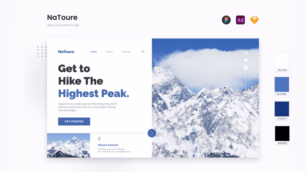
Traveling is healing. That’s why people around the world love traveling to release their stress. Wonder not this business field is commonly associated with the color of freedom and nature like blue. If you are one of those players, dare not to this template, NaToure? This template has a cold color combination under the blue shade. The design is pretty simple, clean, and neat, making this template even more eye-pleasant. People can feel the chill and relaxed vibes that your agency tries to offer.
Colors are the graphic design element that holds an important role to catch your audience’s attention. Combining colors can make your design look incredibly outstanding, but it can be a disaster as well if you put the wrong combination. But don’t hesitate to play with them. Always remember the message you want to deliver and what feeling you want your audience to feel.
Need more captivating website templates? Explore our UI Kit gallery to find the best templates that meet your needs! Kindly contact us for more details and questions! Ciao!

