Web-Safe Fonts vs Google Fonts: Which One Should You Choose for Your Website?
Compare performance, design options, and expert tips to create fast, beautiful websites with perfect typography using Web-Safe Fonts vs Google Fonts.

Your brand needs to stand out instantly. While colors, logos, and messaging get plenty of attention, one silent powerhouse often gets overlooked: fonts for brand personality. The right typeface doesn’t just make words readable. It instantly communicates trust, excitement, sophistication, or playfulness. Studies show that thoughtful typography can boost positive consumer responses by up to 13%.
Fonts influence how people feel about your brand before they even read the text. This is called font psychology. Serif fonts (with small decorative strokes) feel traditional and reliable. Sans-serif fonts (clean and without strokes) feel modern and friendly. Script fonts add warmth and creativity, while bold display fonts grab attention with energy.

Research from Wichita State University confirms serif fonts like Times New Roman convey respectability and trustworthiness, while sans-serif options like Helvetica signal modernity and approachability.
Your brand personality, often described with adjectives like “sincere,” “exciting,” “competent,” or “sophisticated”, should guide every font decision. When typography aligns with your values, customers connect faster and remember you longer.
Understanding the main font families makes choosing fonts for brand personality simple. Each style carries its own tone and impression, shaping how your audience perceives your message. Here’s a quick breakdown:
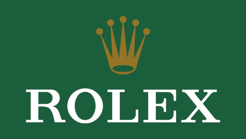
Serif fonts have small “feet” or strokes at letter endings. They carry a sense of history and refinement. This style often signals credibility and long-standing expertise. Many brands choose serif fonts to build trust quickly. They also help create a more formal and polished visual identity.

Sans-serif fonts lack decorative strokes, creating a clean and contemporary appearance. They communicate clarity and simplicity across digital and print platforms. This style feels approachable and easy to read in fast-paced environments. Many modern brands use them to appear efficient and user-focused. They also adapt well across screens and responsive designs.

Script fonts mimic natural handwriting with smooth, flowing letterforms. They create an intimate and expressive visual tone. This style often conveys creativity and emotional connection. Many brands use it to feel more personal and distinctive. It also adds a handcrafted touch that stands out in visual identities.
Display fonts are designed to stand out with strong, distinctive visual forms. They immediately capture attention and create a bold first impression. This style works best for short, impactful text like headlines or logos. When used carefully, they add energy and personality. Overusing them can reduce clarity and visual balance.

Choosing the right typography involves more than visual preference. It requires aligning style, audience expectations, and practical use across touchpoints. A clear, structured approach helps you make confident decisions while maintaining consistency. Follow this simple process to build a cohesive and expressive typographic direction.
Start by identifying three to five clear adjectives that describe your brand. Think about the emotions you want customers to feel. This clarity helps guide your font choices consistently.
Understand who you are designing for and what they expect visually. Different audiences respond to different styles. Balance familiar industry cues with a distinctive touch to avoid blending in.
Always test your fonts across different platforms and sizes. Ensure they remain clear on mobile, web, and print. A good font should look consistent and readable in every context.
Using too many fonts can make your design feel inconsistent. Stick to two or three complementary fonts. Assign clear roles for each to maintain structure and a clean visual hierarchy.
Choose fonts that contrast yet complement each other. A balanced pairing adds visual interest without confusion. Use trusted tools to explore combinations that feel cohesive and aligned with your brand.
Strong typography decisions require both thoughtful choices and clear boundaries. These practical do’s and don’ts will guide you toward more effective and reliable font usage.
Do’s:
Don’ts:
Typography often works quietly, shaping perception before any message is fully read. It influences how your brand feels at first glance. Every curve, weight, and spacing choice contributes to a distinct visual voice. When used intentionally, it builds a stronger emotional connection with your audience.
Great typography decisions are rarely rushed or based on trends alone. They require clarity, experimentation, and thoughtful refinement over time. A well-defined typographic direction remains flexible as your brand evolves. It ensures consistency while still allowing room for growth and creative exploration.
Choosing the right fonts for brand personality means crafting how your brand communicates visually. It shapes recognition, trust, and emotional response across every touchpoint. With the right approach, typography becomes a powerful tool that reinforces identity and leaves a lasting, meaningful impression.