Vibrant Color Palettes in Web Design: Ideas, Tips, and Color Recommendations
See how vibrant color palettes bring energy, clarity, and a more engaging look to modern websites.
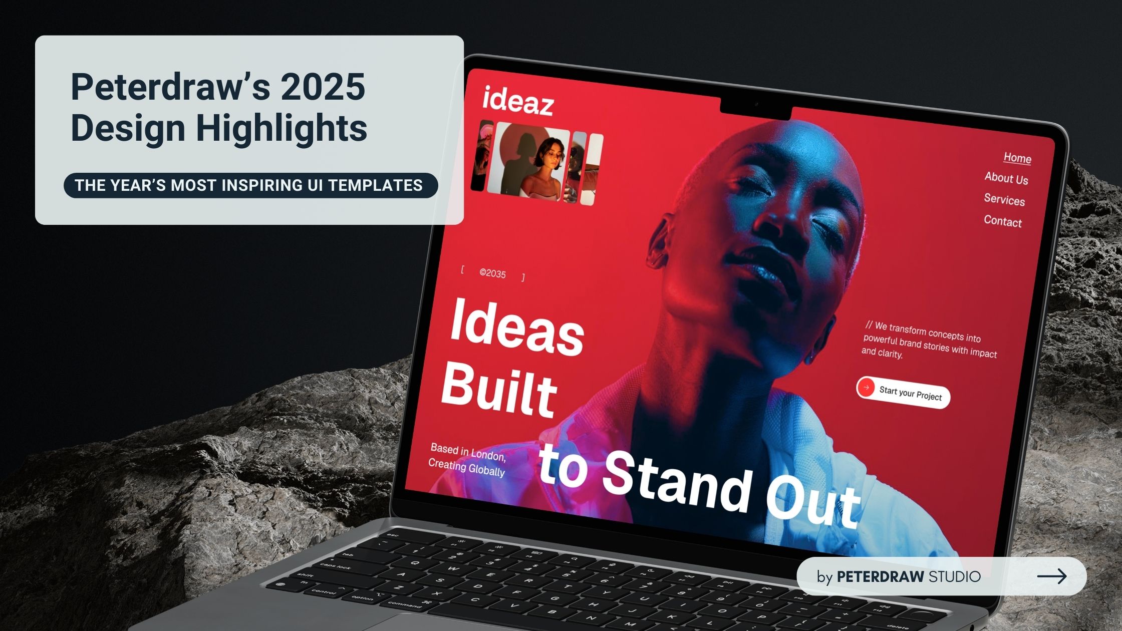

Every year, it challenges designers to raise the bar, and 2025 is no exception. That drive fuels the creation of higher-quality, more versatile UI products tailored to diverse industries and real user needs. Dashboards and website templates continue to lead as the most sought-after categories, drawing strong demand from creators, businesses, and customers alike.
As we did in 2024, the designs spotlighted here were carefully selected using consistent criteria at Peterdraw. We evaluate every template based on Colors, Whitespace, Layout, Hierarchy, Variety, and Imagery. Many of the featured works go beyond these standards, delivering not just aesthetic excellence but also strong functionality and genuine inspiration for new projects.
No template reaches the market without passing through this rigorous review process. From a wide pool of entries, Peterdraw has handpicked the most outstanding designs that truly stand out in 2025. These selections combine visual impact with practical intelligence, earning recognition for their ability to solve problems beautifully and effectively.
A well-crafted landing page should capture attention instantly and guide visitors smoothly without overwhelming them. Layout variation plays a key role in maintaining interest across a single-page design. Alluna nails this by using diverse, thoughtfully differentiated section layouts. It ensures each part stands out clearly while keeping the overall flow intuitive and confusion-free.
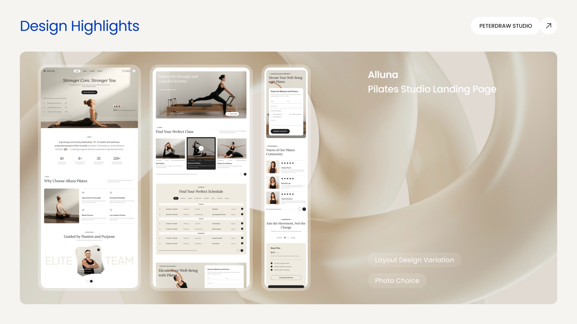
Beyond layout, Alluna excels in its image selection. Every photo shares a consistent, serene color tone that creates visual unison and harmony. It is perfectly aligned with the Pilates and wellness niche. The chosen imagery not only matches the calm, mindful vibe but also integrates seamlessly with overlaid text and other elements. That is what preserving excellent readability and visual hierarchy.
Perfect for Pilates studios that want to convey elegance, balance, and approachability while inspiring potential clients to book a class or join the community.
As one of the high-demand products spotlighting 2025 design highlights, Ventix delivers a standout dashboard that balances bold aesthetics with practical functionality. Its color usage and combinations stand out immediately: dominant, deep, and striking hues. The colors are applied thoughtfully across various widgets, charts, graphs, and images, creating visual impact without ever feeling overwhelming.
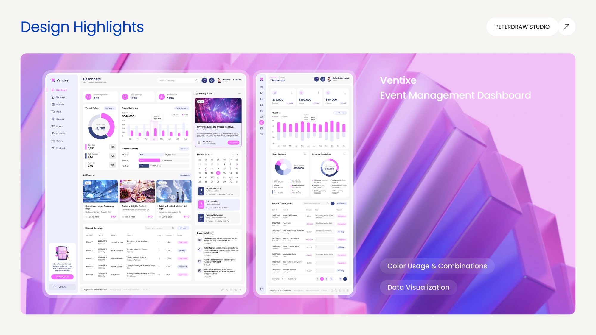
Since dashboards exist to visualize complex data clearly, a variety is essential. Ventix excels here by offering diverse visualization options that are carefully matched to the type of data being presented. This thoughtful correspondence helps users grasp insights quickly and accurately. Thus, it eliminates confusion from mismatched representations.
With its blend of striking design and intelligent data presentation, this dashboard template delivers modern efficiency for growing teams and event-driven organizations. It helps teams track bookings, revenue, schedules, feedback, and performance metrics while projecting professionalism and control.
While sharing some core strengths with templates like Alluna, Ideaz truly stands out in its masterful use of imagery, particularly in the hero section. The striking, high-impact photo immediately captures the bold essence of a creative agency. It commands attention and draws users in from the first second.
Its powerful visual sets a confident tone while blending seamlessly with the overall design theme. Furthermore, the colors and supporting photography reinforce a bold, unapologetic identity across the page.
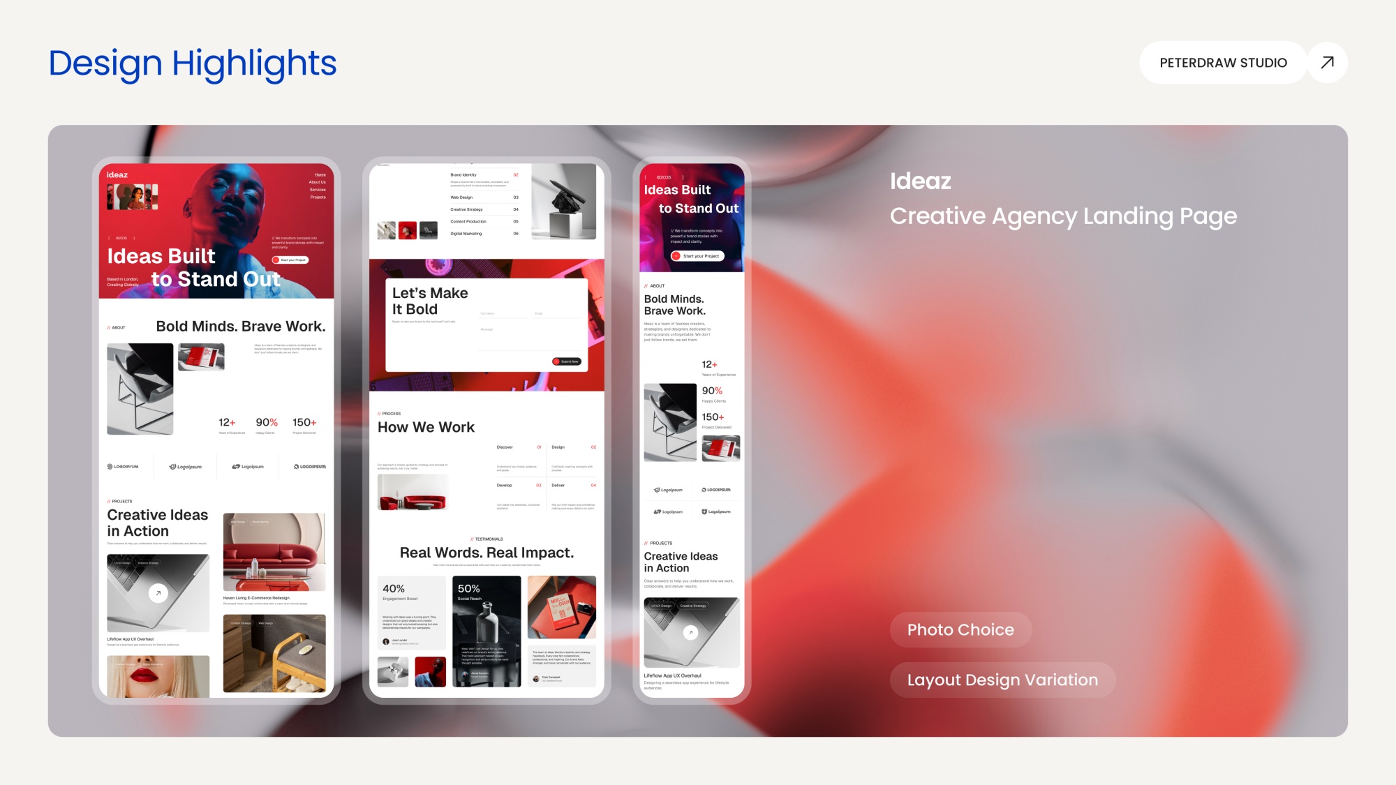
On the layout front, Ideaz goes beyond simple variety. It embraces experimentation. The navigation bar breaks from convention with its unconventional placement. Meanwhile, other sections (notably projects and testimonials) deviate from standard grids and forms in refreshing, thoughtful ways. These creative choices create a dynamic, memorable experience that feels innovative rather than predictable.
This landing page suits those brave enough to stand out and embrace clear differentiation. It empowers brands to push boundaries and showcase work with confidence and personality.
In the hospitality industry, stunning photography is often the most powerful tool for capturing attention and evoking desire. Tripvio excels here by not only selecting breathtaking, high-quality “views” but also weaving them into the overall mood of the website. Every photo element complements the design system perfectly. It creates a cohesive, immersive experience that feels aspirational and inviting from the first scroll.
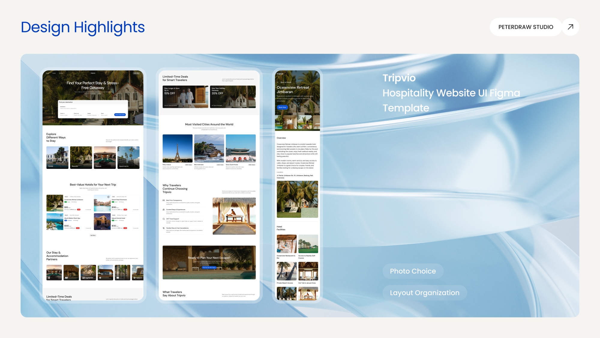
While many templates rely on dramatic layout variations, Tripvio shines through smart layout organization. Handling dozens of images without clutter or overlap is no small feat in travel/hospitality design. And yet, it achieves clean, balanced compositions that guide the eye effortlessly. The result is a website that's visually rich yet intuitive and enjoyable to explore, encouraging visitors to linger and convert.
This template is ideal for showcasing stunning accommodations and highlighting attractive travel deals. It builds trust through transparency and inspires smart travelers to book unforgettable stays.
With the rise of green living and sustainability in recent years, demand for eco-friendly, organic, and "green" products has surged. GreenRoots perfectly meets this growing need as a high-quality Figma template tailored for modern agriculture businesses. Beyond its timely relevance, the template stands out through thoughtful color usage, layout design variation, and photo choice.
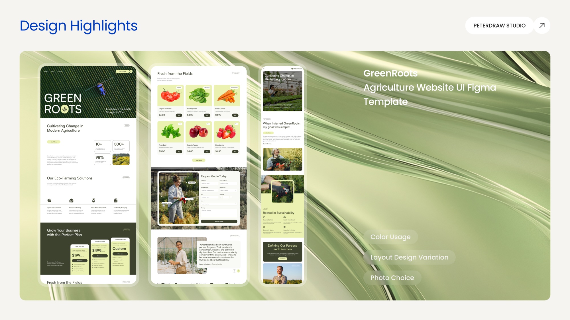
Green serves as the foundational color, evoking freshness, growth, and environmental consciousness. Yet, it is applied strategically rather than overwhelmingly. The palette smartly highlights key sections that demand attention while maintaining balance with neutral tones and earthy accents.
Complementing this thoughtful color use, the photo choices and placements bring clarity and intention to every section. Organic produce, field imagery, and farmer portraits reinforce credibility and emotional connection. Paired with diverse, clean layout variations, this creates a polished, fresh, trustworthy, and nature-inspired look that feels authentic and approachable.
Next in our 2025 design highlights comes Logix, a sleek logistics website template that shines through smart layout variation and confident color usage. The design avoids repetition by switching layouts thoughtfully. Bold hero sections grab attention, clean card grids organize services, and smooth flow diagrams guide users through processes. This keeps the page engaging and easy to navigate from start to finish.
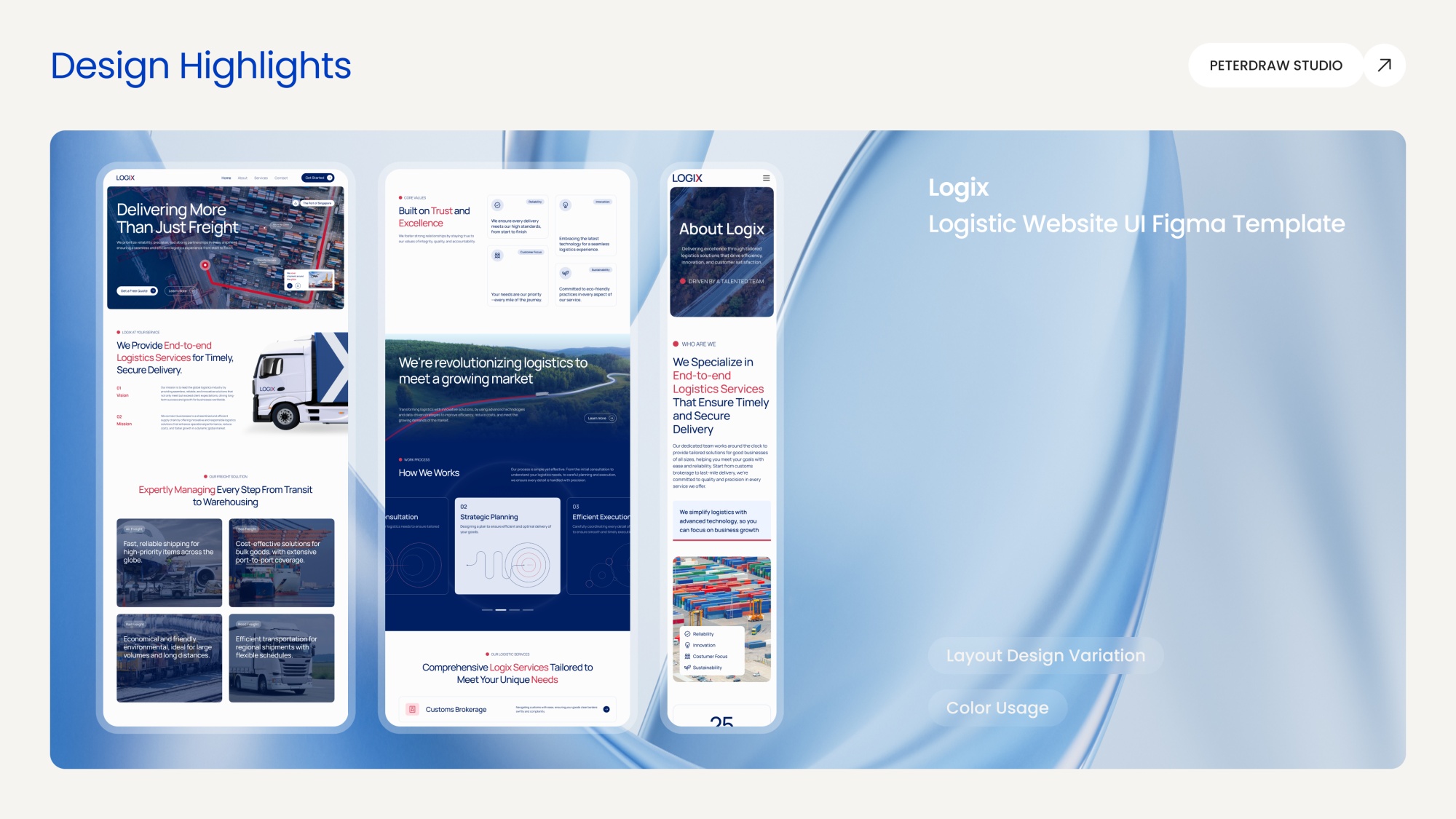
The color palette centers on deep navy and crisp red, balanced with white space and subtle grays. Navy builds trust and reliability, while red highlights key actions like CTAs and progress markers without overwhelming the screen. Strategic accents in route-line blues add energy and direction, creating a professional yet dynamic feel that suits the logistics industry perfectly.
High-quality photos of ports, trucks, global maps, and teams in action integrate smoothly into every section. These visuals reinforce themes of speed, security, and connectivity, making abstract services feel real and dependable. Logix is designed for freight companies, 3PL providers, and supply chain brands. It delivers a modern, credible online presence to attract clients and drive inquiries.
Last but not least, Solvix shines in our 2025 highlights. It fully embraces sustainability in both its solar energy focus and clean design approach, much like GreenRoots. The template stands out with smart layout variation and strong photo choice. Each section feels fresh and purposeful, guiding visitors smoothly from inspiration to action.
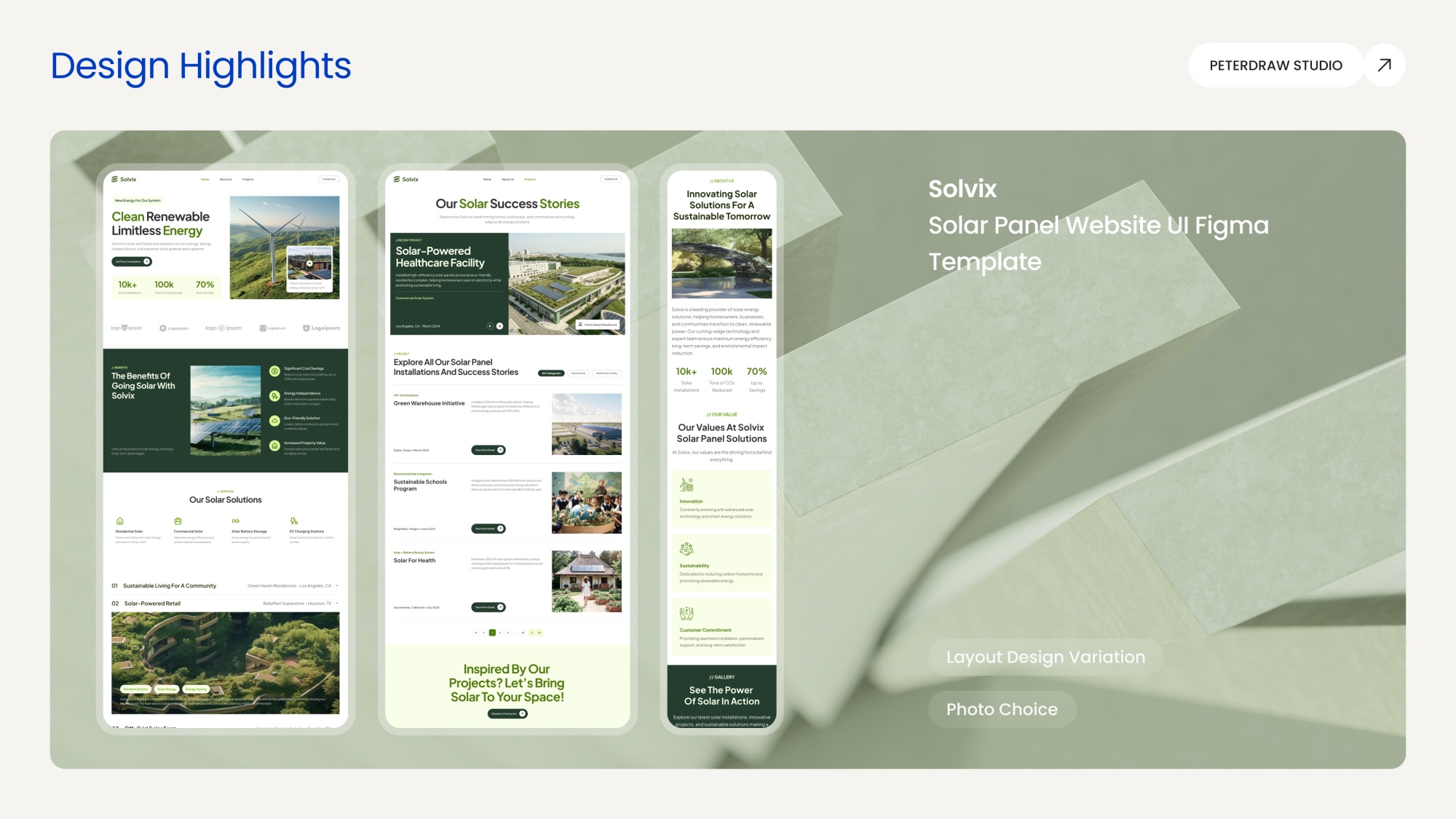
The layout design keeps things dynamic and easy to follow. Hero sections feature striking, prominent visuals to capture attention immediately. Grid-based project showcases organize success stories neatly. Benefit cards and timelines present key advantages clearly without any clutter. This variety makes the page feel modern and inviting.
Photo choice is another major strength. High-quality images of solar panels, green rooftops, and real community projects create optimism and trust. These visuals fit perfectly into every section, from galleries to benefit lists. Bright, natural tones pair well with the green and neutral palette. Together, they inspire confidence and encourage visitors to explore clean energy solutions.
Looking ahead, these 2025 highlights remind us that great design is never static. It evolves by listening closely to real user needs, industry shifts, and emerging technologies. Peterdraw remains committed to discovering and showcasing templates that push boundaries while staying practical and user-centered. We believe the best work ahead will blend bold creativity with deeper purpose.
Our promise for the coming year is simple yet firm: to keep raising the bar. We will continue curating only the most thoughtful, high-impact designs and sharing them openly so creators everywhere can learn, adapt, and innovate faster. Together, let’s shape a future where exceptional UI becomes the standard, not the exception. Here’s to even more inspiring work in 2026 and beyond.