
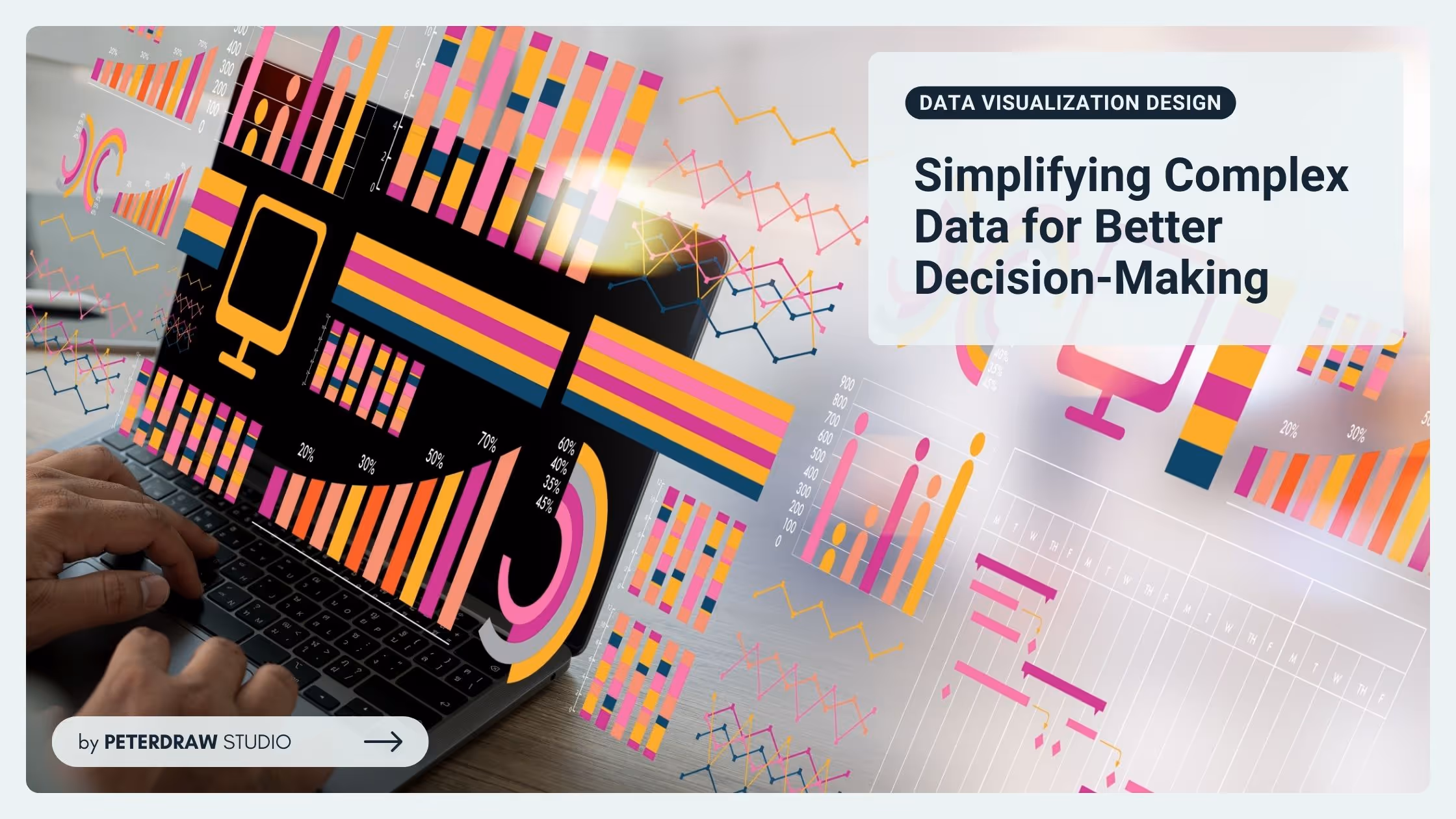
From Web2 to Web3: How Web3 in Web Design Is Redefining Online Ownership
See how web3 in web design blends blockchain, wallets, and UX to create secure, decentralized, user-first digital experiences.

Delivering information, especially something new or complex, always needs the help of other instruments. People hardly grasp the info from unfamiliar data. Comprehending it is another problem that is likely to arise. Visualizing the data will be a good way to deliver it. Data visualization makes the information more understandable and attracts more people. So, it is crucial to create an impressive data visualization design that is appealing yet easy to understand.
Data visualization is the graphical representation of information and data. It involves using visual elements like charts, graphs, and maps to make complex data more accessible, understandable, and usable. The goal of data visualization is to help people see patterns, trends, outliers, and relationships in data, making it easier to interpret and act upon.
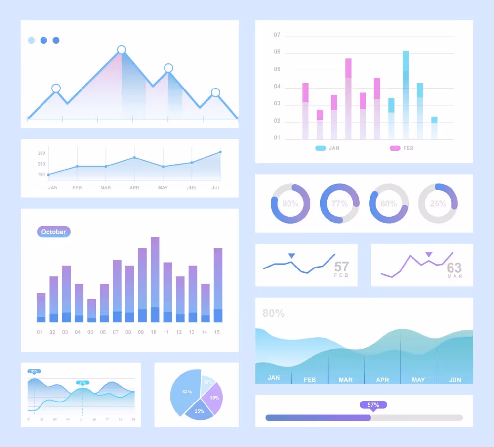
Creating data visualization design usually includes various charts and graphs. Among them, these types are more popular than others.
Bar charts: Represent categorical data with rectangular bars, where the length of each bar is proportional to the value it represents. It makes it easy to compare different categories or groups.
Line graphs: Display trends or changes over time by connecting data points with a continuous line. They are often used to visualize the relationship between two variables.
Pie charts: Show proportions of a whole by dividing a circle into slices, where each slice represents a category’s contribution to the total.
Heat maps: Use color intensity to represent the magnitude of values in a matrix, helping to quickly identify areas of high or low concentration.
Scatter plots: Display the relationship between two variables by plotting data points on a two-dimensional plane. Scatter plots are often used to detect correlations or patterns.
Treemaps: Represent hierarchical data as nested rectangles, where the size of each rectangle is proportional to the value it represents, making it ideal for visualizing part-to-whole relationships.
Designing data visualization is quite different from creating other graphic products. It must be clear, effective, and aesthetically pleasing, considering design principles. At the same time, the design should blend well with analytical thinking to ensure that data can be easily understood and acted upon. Hence, these points must be considered.
Data in visualization mode tend to be more direct. Therefore, it doesn’t need many data points, let alone too many decorative elements. Focus on the most critical data and eliminate unnecessary embellishments. That is why it is significant to emphasize minimalism. It ensures the data is easy to interpret and helps the audience focus on the key insights without distractions.
Different types of data require different visualizations. So, effectively communicating the info will require using different visual formats. Besides, when taking the audience into account, consider their familiarity with data. Experts may prefer detailed and complex data visualization designs, while non-experts benefit from simpler designs.
Visual hierarchy is a substantial aspect of data visualization. To establish a clear hierarchy, designers can use size, boldness, and placement of visualization elements. It will guide the audiences’ attention to the most prominent data points and help them quickly grasp insights.
Use colors purposefully to highlight important aspects of the data, not for decoration. Furthermore, stick to a consistent color palette to avoid confusing the audience. It is better to avoid using too many colors that might distract from the data itself. Another thing to ensure is accessibility for everyone. So, it is best to consider colorblind-friendly options.
Data visualization is not merely presenting data. Its design must be able to tell a compelling story. So, to make the data visualization design the attribute, organize visuals to lead the viewer through a logical narrative. Thus, it will help them understand the context and meaning behind the data.
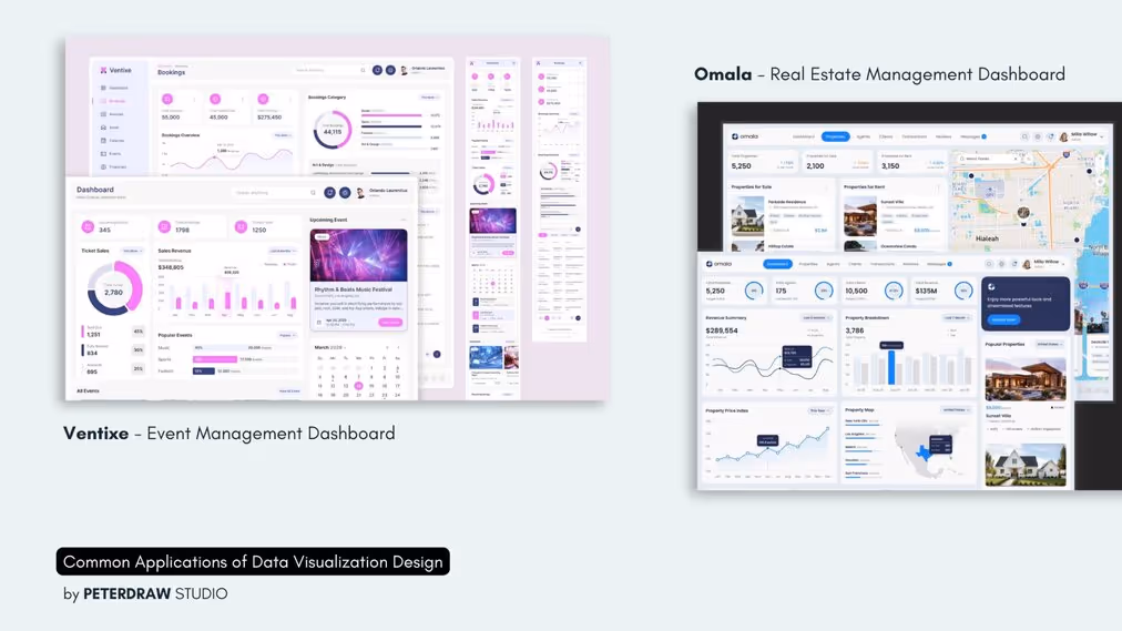
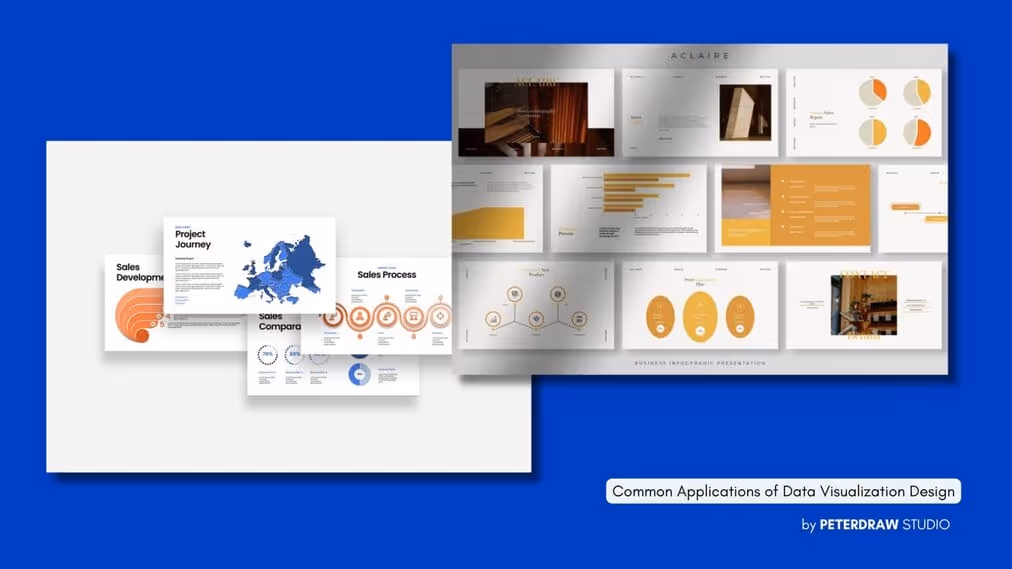
Data visualizations can come in many formats and presentations. Many businesses, fields, or industries use them to enhance decision-making processes and identify critical trends. However, what is the most common format of data visualization to present?
The most common data visualization presentation is an infographic. It is highly versatile and can illustrate various topics, from business data to scientific findings, in an engaging format. In its delivery, infographic blends visuals with concise information to convey complex data quickly. It is often shared on social media or websites for broader audience reach.
Many businesses use dashboards to monitor real-time data gathering. Tracking business performance or project progress is the common use of a dashboard. It provides a comprehensive overview of data in one place, enabling quick decision-making and drilling down into specific details as needed.
Presenting data visualization design in a poster can give an impactful look. It summarizes data or research findings in a clear, static format, often displayed in educational settings or public exhibitions. Moreover, the poster aims to capture attention quickly and communicate key points. So, it is a suitable instrument for showcasing at conferences or community events.
Incorporating data visualization into web pages or apps can increase user engagement. Users can manipulate data through filters, zoom, and other interactive features, allowing them to explore different aspects of the dataset. Media outlets, businesses, or data science platforms often use these visualizations to offer a personalized, user-driven experience for analyzing data.
Professional presentations often use data visualization. Each slide usually focuses on different data insights or key takeaways. The purpose is to provide a structured way to guide an audience through a narrative supported by data visuals, charts, and graphs to reinforce the message.
Visualization in maps is quite different from other data visualization designs. Maps visualize spatial data to show relationships, trends, or patterns across locations. It is often used in urban planning, environmental studies, or epidemiology. The more specific maps are heat maps or choropleth maps. They can represent data intensity in different regions, making geographic comparisons easy to understand.
The existence of data visualization has helped in understanding complex information. The data will be more attractive visually and storytelling-wise with animation. The animated visualization is often used in explainer videos, marketing content, or news segments. These animations help make abstract data relatable and accessible to a broader audience.
Data visualization design can turn complex data into visually engaging and easy-to-understand formats. Business, education, and research often use it for various purposes. Effective data visualization enhances communication and decision-making. It ensures key insights are conveyed and absorbed effortlessly.

.jpg)