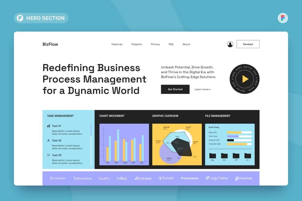
From Web2 to Web3: How Web3 in Web Design Is Redefining Online Ownership
See how web3 in web design blends blockchain, wallets, and UX to create secure, decentralized, user-first digital experiences.

The right visual treat can convey the message better. How you present it is important to achieve that goal. Let’s try to understand two similar but different concepts, flat vs. isometric, for graphic design projects.
Flat design has been around for a long time and was popular in the 50-60s. It made a comeback in the mid-2000s. It is most commonly used for graphical user interfaces, like web and mobile apps. However, the design is also suitable for other graphic materials, such as posters, publishing products, art, and documents. Then, what is flat design? Flat design is a minimalist two-dimensional design style with bright colors.
How about the isometric design? Isometric design is quite a unique style. It presents three-dimensional objects in two-dimensional planes. You still can have three-dimensional drawings without even needing to converge the perspective lines. All the surfaces are usually at the angle of 30 and 90 degrees. You can use this design to create logos, icons, website landing pages and heroes, maps, infographics, and even typography.
Despite the similarities in aspects and differences in concepts, flat vs. isometric designs are popular in their respective fields. However, in some cases, you have to choose whether to use the flat or the isometric one since they have depth differences. The decision-making will be easier when you know what you need. If you only need a simple way to deliver your message, flat design it is. However, when you need to show some realism, isometric design it is.
It’s no surprise that flat design is popular, especially among UI designers. Its simplicity is the key to its popularity. It brings many benefits, especially in winning over website users. Flat design wins the users because of the following.

People will get the information when they understand what they read and see. Flat design meets that user’s needs. It replaces complexity with something more simplified and minimalist, such as in logos and other vectors. Besides, it usually consists of only one contrasting background color and clear typography with san-serif fonts to create a readable product.
Some decorative elements can make design products more appealing. But sometimes, it is less effective and a distraction. This flat style aims to present a more effective design without distraction. You can direct the user to focus on the main content. Therefore, the availability of white space is crucial in the design style.
Imagine how annoying it is to open a website that takes a long time to load. If you provide that quality to your users, no one wants to come back to reuse and revisit your website. The flat design style will help you a lot, especially when you cannot cut down any more content. With a more light image size, the conversion and revenue for a website will increase.
Having good SEO is what every business needs to stay on the top search. And, having a better loading speed is helping in increasing your SEO score. So, a flat design style can affect many aspects of your business, especially online.
While flat designs are popular for their minimalism, isometric designs are popular for their depth and dimension. The design style is also more popular among graphic designers, especially those who work on infographics and logos. Then, what benefits does isometric offer?

When competition demands creativity, isometric designs can answer the challenge. It is best for your illustration and icon design works. However, have to keep it simple to keep it understandable. That way, you can offer a straightforward, recognizable, and appealing visual.
Providing different perspectives to viewers can deliver more details. The isometric style allows your audience to enjoy your work from the top, sides, and front. You can try to apply it to illustration and drawing. It will be good for marketing. Since it is the extension of flat design, you can show what flat images usually can’t.
Besides offering a creative look, this style also presents a modern look. That way, you will more easily attract audiences, especially younger ones. People don’t easily miss something eye-catching and stand out. So, you can make the most of this style for your business needs.
Since the isometric design emphasizes details, it can convey messages more clearly. It is very useful in explaining complex information, such as maps and infographics. You can provide information in a simpler yet still complete and easy-to-understand manner.
Is a hard choice necessary? Not always. In some projects, blending flat and isometric designs is possible. This fusion brings both depth and simplicity into play. The result is a versatile, dynamic visual representation.
However, there are technical aspects to consider. Merging these styles could affect loading speed. It might also make the design visually overwhelming. Assess the project’s limitations before making the leap. A balanced approach is key for successful integration.
Who is your target audience? Different demographics have different preferences. Older users might prefer simpler, flat designs. Younger audiences may be drawn to dynamic, isometric elements. Knowing your audience can dictate your design choices.
Don’t be afraid to experiment. Testing multiple designs can provide valuable insights. A/B tests can reveal which style resonates more. Ultimately, feedback from real users is invaluable. Use it to fine-tune your final design choice.
Whether you lean towards flat design’s minimalism or isometric design’s depth, both offer unique advantages. Flat design excels in clarity and speed, while isometric design brings depth and detail. Your choice hinges on your project’s specific needs and the message you aim to convey. Choose wisely to maximize your design’s impact by understanding the flat vs. isometric positives and negatives.