10 Dark Mode Design Tips: How to Build Interfaces Users Actually Love
Unlock 10 dark mode design tips to improve contrast, reduce fatigue, and deliver sleek, accessible interfaces users enjoy day and night.

Solid colors are what people usually use to paint a drawing or design. Thanks to the advance of technology, the gradient trend rose in the late 1990s and early 2000s. As it develops, gradients become a style in design and experience periods of ups and downs in design trends. The concept application is more extended, not limited just to one design element. Here, we will find out more about the gradient design trend.

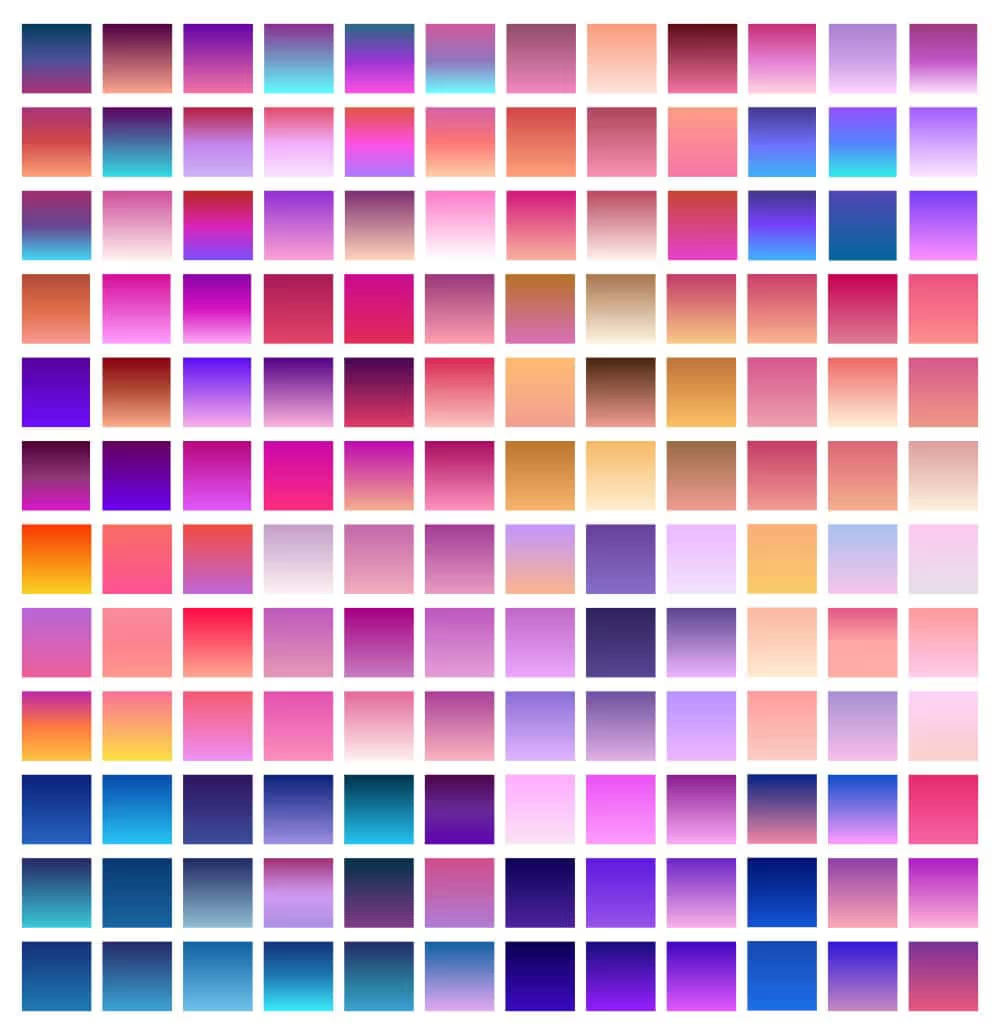
The gradient is a gradual transition between two or more colors or shades. So, if we should define the gradient design, it may refer to gradients used in various design elements. Its smooth transition creates a blended effect instead of an abrupt change from one color to another. Using gradients can create a sense of depth, dimension, and visual interest. Besides, it also adds modern and dynamic vibes.
Since its inception, the gradient design has undergone many changes. Moreover, currently, the development of digital technology is increasingly rapid. It has quite a big influence on the use and appearance of the gradient itself. Here is a general overview of the development of gradient design trends over time.
Since the emergence of digital devices till the late 90s, the use of digital design tools was off-limit. However, the late 90s marked a more accessible digital tools era. It opened to various new possibilities and allowed designers to explore beyond what they usually do.
These changes continued until the early 2000s and marked web design trends change, known as Web 2.0. In this period, the gradient was not the only trend that rose. It also was the rise of glossy buttons, reflections, and other visual effects. So, designers aimed to create more interactive, polished, and visually appealing user interfaces.
Unfortunately, the hype of the gradient era didn’t last long. Design trends shifted towards minimalism and flat design. It might be driven by the desire for cleaner, more user-friendly interfaces in response to information overload. Plus, the emergence of mobile devices was another reason for it would perform well with simpler design. So, in the mid-2000s, gradients took a back seat.
Gradient design trend gained its revival in the late 2000s to early 2010s. Designers had an interest in breaking away from the format of simplicity. They embraced a more dynamic visual and vibrant aesthetics, like experimenting with vibrant color combinations and subtle gradients. It enhanced user engagement and created a sense of depth, especially in branding and UI designs.
The use of gradients persisted into those years. In fact, there is a distinct trend of brands adopting gradients in their logos and branding materials. They carried bold and vibrant gradients to appear modern and dynamic, especially in digital and online spaces.
The passing of the years has not dampened the popularity of gradients among designers. Its popularity is increasing, and its uses are more diverse instead. In 2018, it gained more popularity in UI/UX design with CSS gradients for dynamic web interfaces. It also gained popularity in digital art and illustration to create depth and realism.
Entering the 2020s, designers applied gradients to backgrounds, illustrations, and typography by exploring various applications. Besides, there has been a gradient design trend toward more subtle gradients. So, it provided a sophisticated and elegant look.
Based on its development, the use of gradients changes over time and various design applications with various tools. Regardless of the trends that have existed until now, here are the best applications of gradients in designs.
Design trends are often cyclical. They come and go at some periods, and so does the gradient design trend. At some point, it may get its popularity, followed by the phase of another design trend. The use and style of design itself grow and evolve, adapting to changes in technology, design tools, and aesthetic preferences. However, you don’t need to limit your creativity just because of a trend. If necessary, you can use gradients in your design at any time.