From Web2 to Web3: How Web3 in Web Design Is Redefining Online Ownership
See how web3 in web design blends blockchain, wallets, and UX to create secure, decentralized, user-first digital experiences.
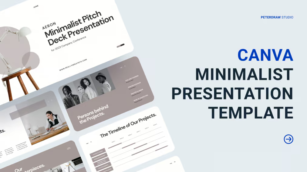
Canva has become the most commonly used application to create and present a presentation, especially for the young generation. It is simple and easy to use. Canva even provides ready-to-use templates to make your presentations more attractive. You can pick any style, including minimalist presentation template style.
Sometimes, to impress the audience, you put your all into creating or choosing a stunning template design. Unfortunately, this effort is often excessively done so that instead of making an impression it makes the audience uncomfortable. Aside from this reason, here are other whys you better choose a minimalist presentation template, especially for business purposes.
Slide presentation provides visual help. However, too many elements of decoration can distract the audience. Meanwhile, the information means to share cannot be delivered well. The minimalist design helps the audience focus more on the most important part. It guides them to see what supposed to see.
Adding some elements to your presentation design will make it looks more attractive, as long as you can arrange it well. And to have this perceivable slide took a long time. Using a minimalist presentation template helps you save time in completing your slides. It also prevents you from making a messy presentation.
White space is not merely a blank space on a presentation slide. It can guide the audience to the space with elements. It is also what helps people focus more on the content than on the element of decorations, such as icons, images, shapes, lines, etc. This white space will urge you to look at the space with something on it eventually.
Minimalist style is simple, yet it can make people in awe just by its simplicity. When simple things are enough to get others’ attention, why bother using complicated ones? If you are one of that many people who are into this style, you will love the list of this presentation template. Are you ready to pick one or all of them? Let us find out!
Being a minimalist doesn’t mean you can’t be bright and cheerful. At least, this is what the White Ivory Minimalist Startup Company Profile Presentation Template tries to show you. You will not find exaggerated elements in the design to keep it simple. Besides, the clean white background, with magenta pink, and blue as an accent, makes it look bright and cheerful.
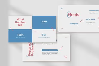
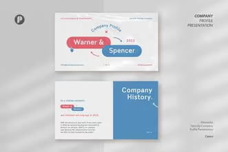
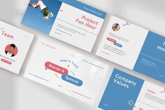
This template usage is not limited to startup only. Any business you manage in any field can use this template. It is the perfect company profile, business plan, marketing strategy, or other business presentation. It never hurts to look the way you want, even though you use a minimalist design.
Although beige is not a default color for minimalist presentation templates on Canva, many still prefer that color for their minimalist design. If you are one of those believers, this Warm Earth Minimalist Brand Guideline Presentation Canva Template can be a perfect choice. It has a soft vibe that will be perfect for any business related to design, fashion, food, and more.
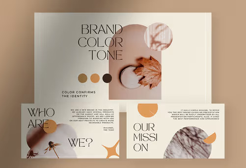
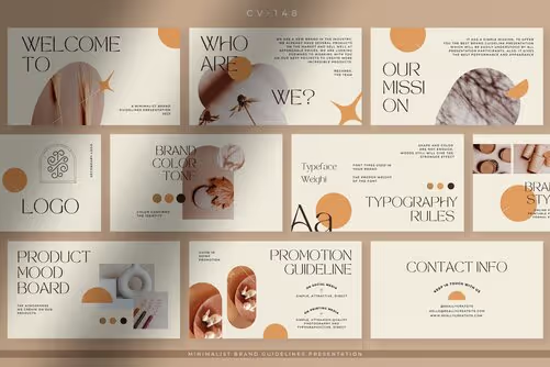
Although this template is designed for brand guidelines, you can apply it to your marketing kit or brand rules presentation. The overall design plays with large headings and small body text. Even so, it will accommodate all the text you should include. The template is not only functional but also attractive as a presentation display.
To look more professional, many people choose a clean and neat template using white as the main background. Nothing wrong with this style because there’s a time when you need it. When the time has come, Aeron, the white minimalist modern pitch deck presentation Canva template, will help you. It gives you a minimalist look in a modern style.
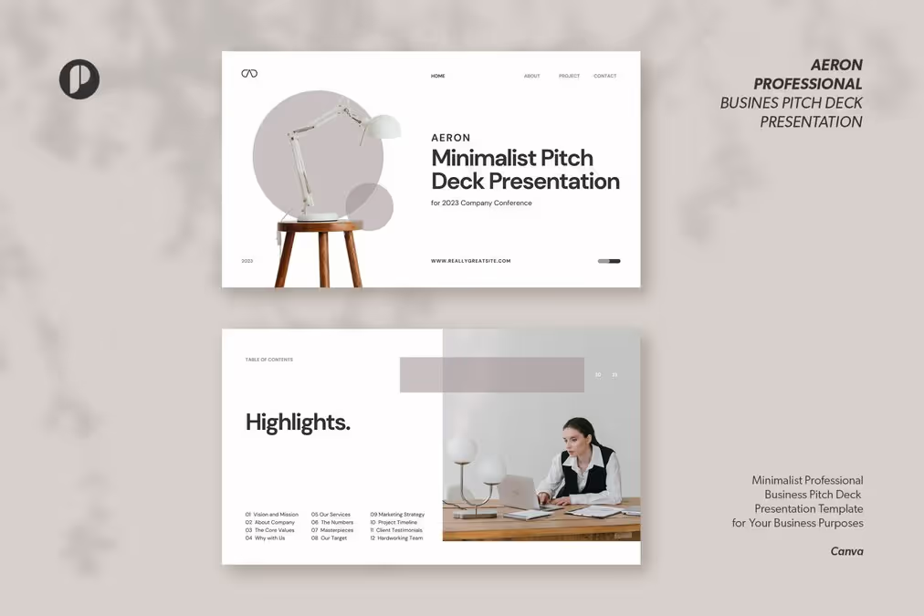
The well-organized layout in this template offers a perfect look that will impress the audience. Also, every slide can accommodate all the information you need to share. It is not only in textual form but also in graphics or charts. Offering partnership, proposal, or cooperation will be a lot easier. If you find the slides in this minimalist presentation template are not enough, you can duplicate and adjust them as needed.
Some businesses need elegant touch to represent their identities. It usually includes fashion, design, or beauty brands. To strengthen this identity, you can not only depend on the product and the company logo or brand. The presentation template you use also should represent it. This Elegant Minimalist Business Proposal Presentation Canva Template will strengthen your business persona.
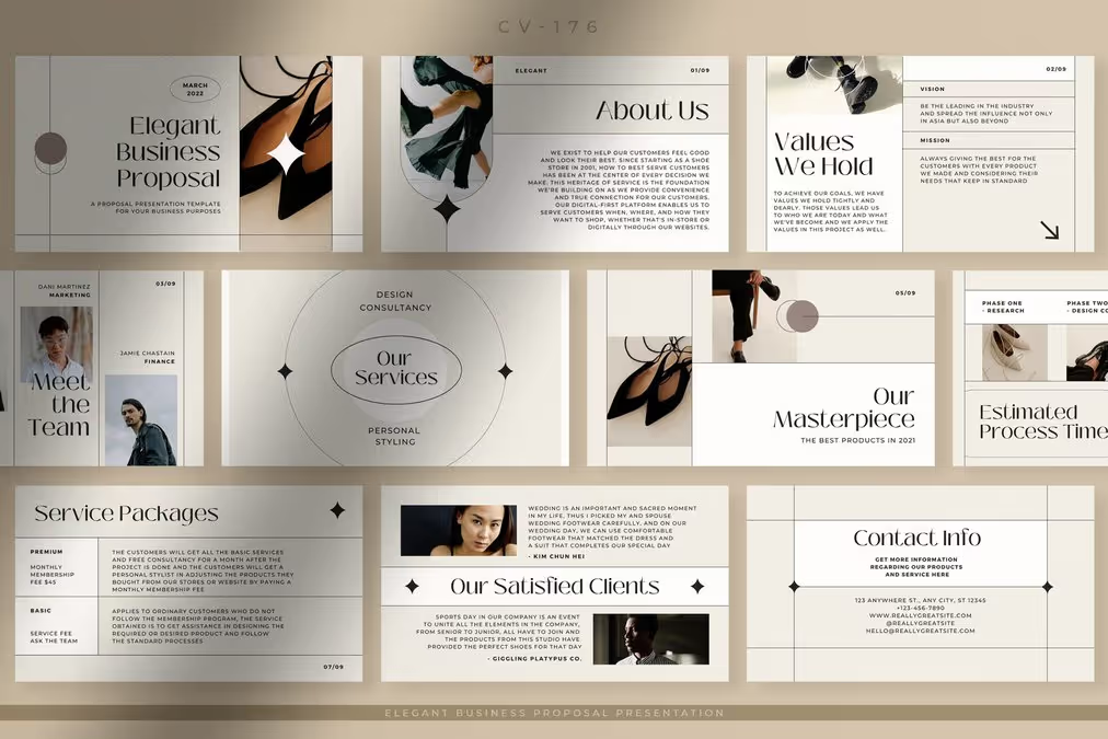
Unlike other minimalist presentation templates that play save using colors, typeface, or minim decoration, this template utilizes lines. Every line differentiates every section in the slide, which also function as a decoration. This template is perfect for formal or semi-formal presentations.
Another misleading piece of information about minimalist style is the use of decorative elements. Being a minimalist doesn’t mean you can add any decorative element to the presentation. You may add some, but remember to put it as minimum as possible. The Lime Minimalist Healthy Food Business Presentation has proven it. It is still in the corridor of minimalist style. You can see some leaves decorated to make it more outstanding.
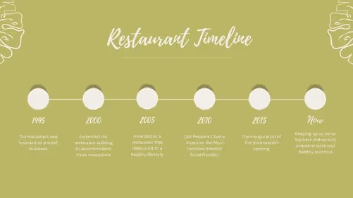

As this template is for a healthy food business, the leaf decoration is a perfect choice to apply. It increases the aesthetic value and no more plain look. You can still use this template for any other business you manage, like herbal products or nature-related ones. There is no reason not to look attractive even with a minimalist style, right?
Most business presentations have a formal and professional look. This look is needed to show the credibility of the company. Unfortunately, many find such a display boring. Take it easy. This Deep Blue Minimalist Brand Guideline Presentation Template will help you give an attractive presentation.
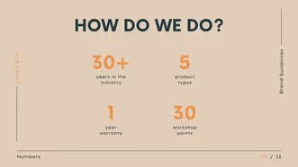
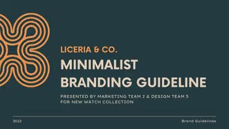
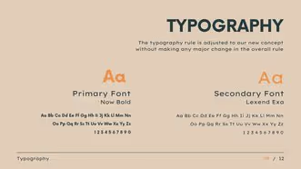
Although it is the most formal look among the minimalist presentation templates, the overall design is not rigid. Even the masculine vibe in this template will strengthen your confidence in delivering the presentation. You can use this template for various business presentations, especially guidelines, marketing kits, and business offers.
You don’t need excessive effort to impress and attract people. A minimalist presentation template can do it well. You also don’t need to be afraid that you can’t be creative with a minimalist style. It allows you to be you, so long you use the minimum elements to include in the design you create or use. Now, it’s your time to impress your audience using minimalism.