

.jpg)
Web Design Trends 2026 Part 2: 6 Emerging Styles Shaping the Year
Stay updated with web design trends 2026, featuring TL;DR experience, 2.5D design, and more, plus useful implementation tips.


Fonts are the silent heroes of web design. They shape how users feel about your site before they even read a single word. But when it comes to Web-Safe Fonts vs Google Fonts, many beginners (and even some experienced designers) get confused. Which one loads faster? Which looks better? And which one actually helps your SEO and user experience?
For easy understanding, we’ll break down the real differences between Web-Safe Fonts and Google Fonts, their pros and cons, real-world examples, and exactly when to use each.
Web-safe fonts are a small group of typefaces that come pre-installed on almost every computer, smartphone, and tablet. Because they’re already on the user’s device, the browser doesn’t need to download anything extra. Your text appears instantly.
These fonts were created in the early days of the web (think 1990s–2000s) when internet speeds were slow and designers needed guaranteed consistency across Windows, macOS, Android, and iOS. Even with fast 5G and fiber internet, web-safe fonts deliver perfect performance and zero risk of “flash of unstyled text” (FOUT).
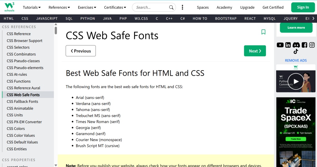
Popular Web-Safe Font Examples:
Google Fonts is a free, massive library of over 1,900 high-quality, open-source fonts hosted by Google. You simply add a small line of code to your website, and the browser downloads the font files on demand.
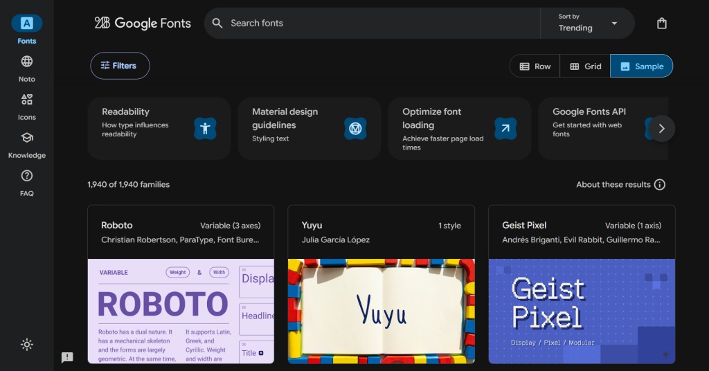
It’s incredibly popular among designers because it gives you beautiful, modern typography without paying licensing fees. Google Fonts are designed specifically for screens, come in multiple weights and styles, and look consistent on every device—exactly as you intended.
Popular Google Fonts Examples (2026 favorites):
When comparing web-safe fonts and Google Fonts, key differences clearly stand out.
Each option affects performance, design flexibility, and loading behavior. Choosing the right type depends on your website’s goals and priorities.
Web-safe fonts are pre-installed on most devices, so no download is required. This allows text to display immediately without external requests. Google Fonts are hosted on external servers and must be downloaded. This process adds a small step before the font appears.
Web-safe fonts offer a limited selection, with only 20 to 30 reliable choices. These fonts are widely supported across operating systems. Google Fonts provide over 1,900 font families and continue to grow. This gives designers far more flexibility and creative freedom.
Web-safe fonts load instantly because they require no additional HTTP requests. This makes them the fastest option for text rendering. Google Fonts need an extra request to load from servers. While fast, this can slightly increase loading time.
Web-safe fonts tend to look basic and more conservative in style. They are suitable for simple and functional designs. Google Fonts offer modern, creative, and expressive typography. This helps create stronger branding and more visually engaging websites.
Web-safe fonts are generally consistent but may vary slightly between operating systems. Small differences can appear in rendering across devices. Google Fonts maintain consistent appearance across browsers and platforms. This ensures a uniform look for all users.
Web-safe fonts provide excellent performance with no impact on loading metrics. They are ideal for speed-focused websites. Google Fonts perform well when properly optimized. However, poor implementation can affect Core Web Vitals and overall performance.
Both web-safe fonts and Google Fonts are completely free. Web-safe fonts do not require external resources. They are available by default on most systems. Meanwhile, designers can access a large library of Google Fonts without additional cost.
Web-safe fonts work best for speed-focused sites, emails, and accessibility projects. They ensure fast loading and reliable rendering. Google Fonts are ideal for branding, blogs, and creative portfolios. They help create a more distinctive and polished visual identity.
When choosing between Web-Safe Fonts vs Google Fonts, every website must balance two key factors: speed and visual appeal. Web-safe fonts load instantly because they are pre-installed on devices, while Google Fonts must be downloaded from Google’s servers. This small difference affects page speed, user experience, and even search rankings.
Web-safe fonts win on speed. They require no extra downloads, making them the fastest option. Switching from a Google Font like Open Sans to Arial can save up to 200 milliseconds per page load. Google Fonts, however, can cause layout shifts (Cumulative Layout Shift) when the custom font replaces the system font, which hurts Core Web Vitals.
To improve Google Fonts performance, use these quick tips:
Web-safe fonts are reliable and highly readable, but they often feel basic and “1990s corporate.” They offer limited design choices and don’t help your brand stand out.
Google Fonts provide modern, creative options that make your website look professional and unique. You can easily create a strong brand identity with fonts like Inter, Roboto, Poppins, or Playfair Display.
Use web-safe fonts when speed is critical, such as e-commerce sites, news portals, emails, or accessibility-focused projects. Example: A banking site using Arial for body text and Georgia for headings feels trustworthy and loads instantly.
Use Google Fonts when branding matters most, perfect for blogs, portfolios, SaaS products, and creative websites. Example: A fitness blog combining Poppins headings with Open Sans body text looks energetic and modern.
Many sites use a hybrid approach: Google Fonts for headings and web-safe fonts for body text. This delivers great design without sacrificing too much speed.
There is no single winner in the Web-Safe Fonts vs Google ****Fonts debate. It all depends on your goals. Need maximum speed and bulletproof compatibility? Choose web-safe fonts. Want a beautiful, unique brand experience? Go with Google Fonts (and optimize them properly).
Most professional websites today use a smart hybrid approach: Google Fonts for headings where design matters most, and web-safe fonts for body text where speed and readability win. The key is understanding the trade-offs. Great typography isn’t about picking the coolest font. It’s about choosing the right one for your users, your brand, and your site’s performance.