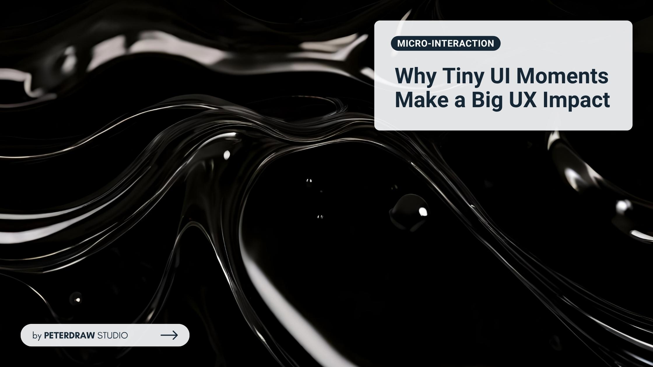
Micro-Interaction: Why Tiny UI Moments Make a Big UX Impact
Micro-interaction guide for web UI/UX: learn key types, real examples, and best practices to boost clarity, trust, and engagement.


Using bright and striking colors makes it easy to get the audience’s attention. However, it doesn’t mean you must use them on various occasions and for different needs. Sometimes, calming colors are what you need to convey meaning or message better. Pastel colors meet these requirements. At the same time, they have aesthetic values that can attract the audience. So, what is it about the pastel aesthetic?

Pastel aesthetic is characterized by its soft, muted colors that create a light, airy, and often dreamy visual experience. This aesthetic is commonly associated with calmness, tranquillity, and nostalgia feeling. Although typically pastel colors include light shades of pink, blue, green, purple, yellow, and peach, they also include others, such as below.
People use pastel colors in graphic design for several reasons, primarily due to their visual and psychological impact. Besides, different colors can give a different impression and convey a different message to the audience. All the reasons for using pastel colors are below.
Creating a serene and welcoming visual experience is possible using pastel colors. Those colors are soothing to the eyes and evoke calmness and relaxation. Furthermore, their gentle tones help reduce visual stress, making viewers feel more at ease and comfortable. It can be particularly effective in wellness, health, and lifestyle designs.
Even though they have their own impression and aesthetic, pastel colors can be used across various design projects. Pairing them with other colors and design elements is easy, too, making them highly versatile. Pastels can serve as backgrounds, accents, or primary colors in a palette, adapting to various design needs and styles.
Incorporating a pastel aesthetic can bring a contemporary feel since pastel colors have become trendy in recent years. They are highly popular, especially in minimalist and modern design styles. Their usage creates emphasis while maintaining a cohesive and harmonious look. Plus, their soft nature ensures that key elements stand out subtly.
Soft colors, such as pastels, tend to be non-threatening and approachable. They are suitable for brands and products that convey friendliness and inclusivity. Their gentle hues appeal to a wide audience, breaking down barriers and fostering a sense of welcome and openness. It is beneficial for customer-focused brands, creating an inviting and approachable image.
Something with a nostalgic feel is easier to evoke feelings. The pastel aesthetic has the quality of nostalgia and, at the same time, a whimsy sense. They can remind people of childhood, springtime, and other pleasant memories. Hence, they are effective for designs aimed at evoking an emotional response. Furthermore, those qualities can be leveraged in branding and marketing to create a sense of familiarity and comfort.
Color is not the only element that makes up the pastel aesthetic. Other components are needed to form the desired overall aesthetic that attracts the target audience. Here are the complete key elements.

Color Palette – Soft, light colors dominate the palette. Pastels are desaturated and less intense compared to primary or neon colors.
Textures and Patterns – The aesthetic often incorporates gentle textures like smooth gradients, watercolor effects, and subtle patterns, such as polka dots, stripes, or florals.
Imagery – Common imagery includes clouds, flowers, cute animals, and other whimsical or dreamy visuals.
Design Style – The pastel aesthetic is used to create visually pleasing, non-intrusive designs, often used in branding for products that want to convey a sense of calm and approachability.
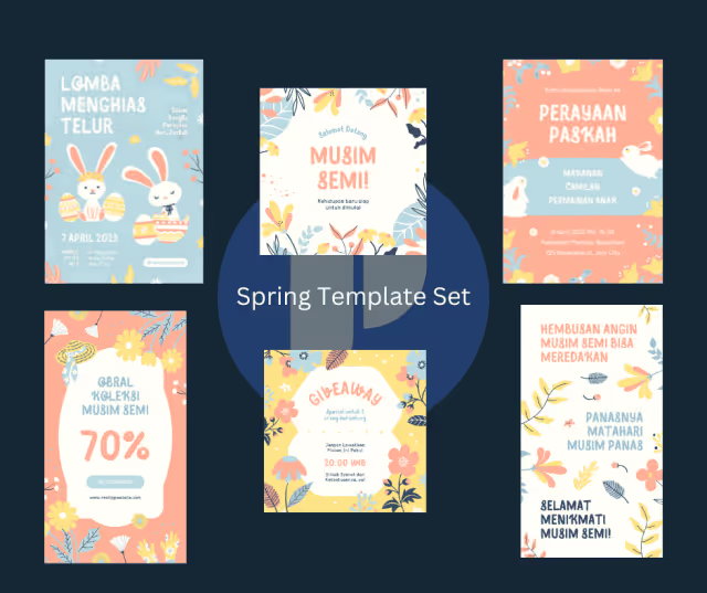
Creating a pastel aesthetic involves selecting soft, muted colors. These hues evoke calm, nostalgia, and warmth. Effective combinations transform websites, brands, and decor. Try these combinations for your next project.
Timeless and versatile is what the classic combination offers. This combination is perfect for creating soothing and elegant designs. Pink and blue is a gentle and soothing combination, suitable for baby nurseries and spring-themed designs. Green and yellow bring a fresh and vibrant vibe, perfect for nature-inspired designs. The last combination is purple and pink for romantic and delicate feelings, such as wedding themes and feminine designs.

Pastel colors can bring the refreshing and tranquil elements of the outdoors into your designs. These color pairings reflect the beauty of nature, creating a serene and calming atmosphere. Green and lavender are a calm and refreshing combination, ideal for holistic health brands, botanical illustrations, and gentle, inviting web designs. Peach and mint are light and breezy, perfect for beauty products, tropical or summer-themed designs, and playful, yet sophisticated, web interfaces.

Even though it has a soft feel, pastel colors also bring a warm atmosphere. The warm combinations are inviting and cheerful, adding a cozy and friendly touch to any design. The coral and peach combination is warm and inviting, perfect for wedding invitations, summer-themed designs, and lifestyle blogs. Yellow and orange are cheerful, sunny, and energetic, suitable for event invitations, cheerful branding, and fun, lively web design.

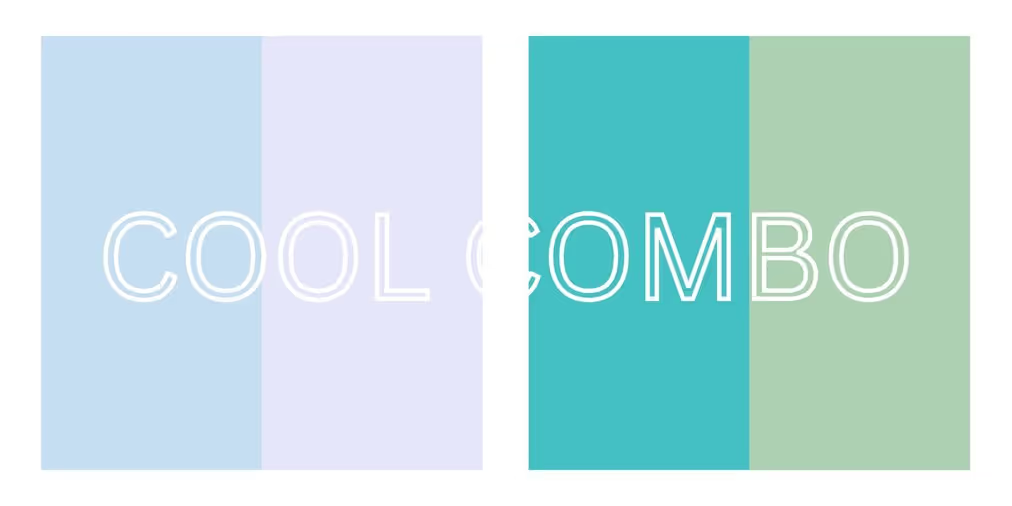
Looking modern is more suitable when applying cool pastel combinations. They also offer a tranquil aesthetic, perfect for creating a relaxed and serene environment. These color pairings are ideal for tech, wellness, and contemporary designs, providing a clean and refreshing look. Some of the combinations are the soft and serene of blue and lavender, the refreshing and tranquil of mint and teal, and the modern and calming of blue and gray.
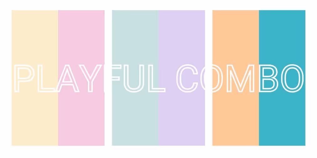
Pastel color combinations work well for fun and energetic design projects, by pairing vibrant and lively colors. They are suitable for children’s products, party decorations, and any project to evoke joy and excitement. Try to pair yellow and pink for a bright and fun atmosphere. The purple and green combination is also good to be whimsical and lively. Also, use orange and teal to bring a vibrant and playful mood.
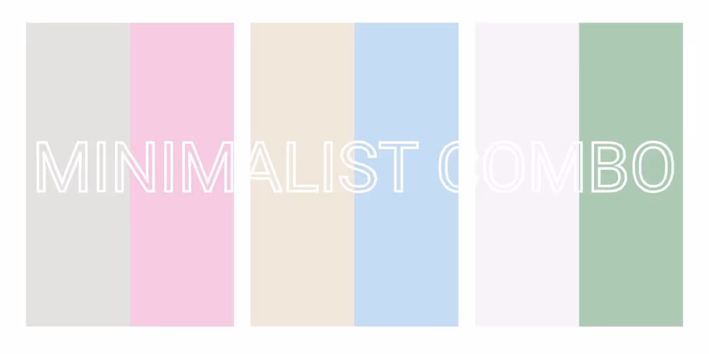
Do not hesitate to use pastel colors when minimalist design comes into mind. Minimalist combinations are elegant and understated, ideal for creating clean and sophisticated designs. Their subtle and refined aesthetic makes them perfect for modern branding, interior design, and digital interfaces. Use gray and pink to create elegant and clean designs, beige and blue for a neutral and calming vibe, and white and mint for a crisp and fresh atmosphere.
Embracing the pastel aesthetic can significantly enhance the visual appeal and emotional resonance of your designs. These soft hues offer versatility, modernity, and a sense of calm, making them suitable for various applications. Incorporate pastel combinations thoughtfully to create inviting, aesthetically pleasing, and memorable visuals. You can get something that is not too flashy but attracts attention eventually.